
A landing page is a standalone web page that one specific traffic source sends visitors to, such as a paid ad, an email, a search result or a referral, and it is built around a single primary action: buying, registering, downloading or submitting contact details.
You've almost certainly met one this week without naming it. An ad promised free shipping on a serum, you clicked, and the page you landed on had one button and no menu. The page ranking first in Google for that same serum was a product page, and the brand's homepage was a third thing entirely. Three pages, one shop.
The label doesn't live in the design. It lives in where the visitor came from and what they were promised on the way in. Answer that and the question "what is a landing page" stops being abstract, because the same URL can be a landing page for a cold TikTok visitor and a homepage for someone who typed your brand name.
Table of Contents
- What a Landing Page Is and How It Works
- Landing Page vs Homepage, Product Page and Advertorial
- The Parts Every Landing Page Needs
- Landing Page Types and How to Choose One
- Measuring Whether a Landing Page Works
- Build and Test Your First Landing Page
What a Landing Page Is and How It Works
Think of a shop window on a busy street. It's dressed for one passer-by and one idea: this coat, this price, this week. The store behind it is built for browsing, with aisles, a till and a returns desk. Same business, two different jobs.
A landing page is the window. Everything behind it still exists, the catalog, the policies, the blog, the cart. The page in front has one job, which is to take the expectation a visitor arrived with and turn it into a single next step.
That mechanism is older than advertising. CERN had the first web server and page running at info.cern.ch in 1990, and the first public website launched on August 6, 1991, working in exactly this way: a focused destination that explained a proposition and pointed readers toward more information, as NPR's look back at the very first website recounts. That page was informational rather than commercial. The structure carried straight over into marketing funnels.
The arrival points matter more than the layout, which is why the page is best understood as a destination built around one source.
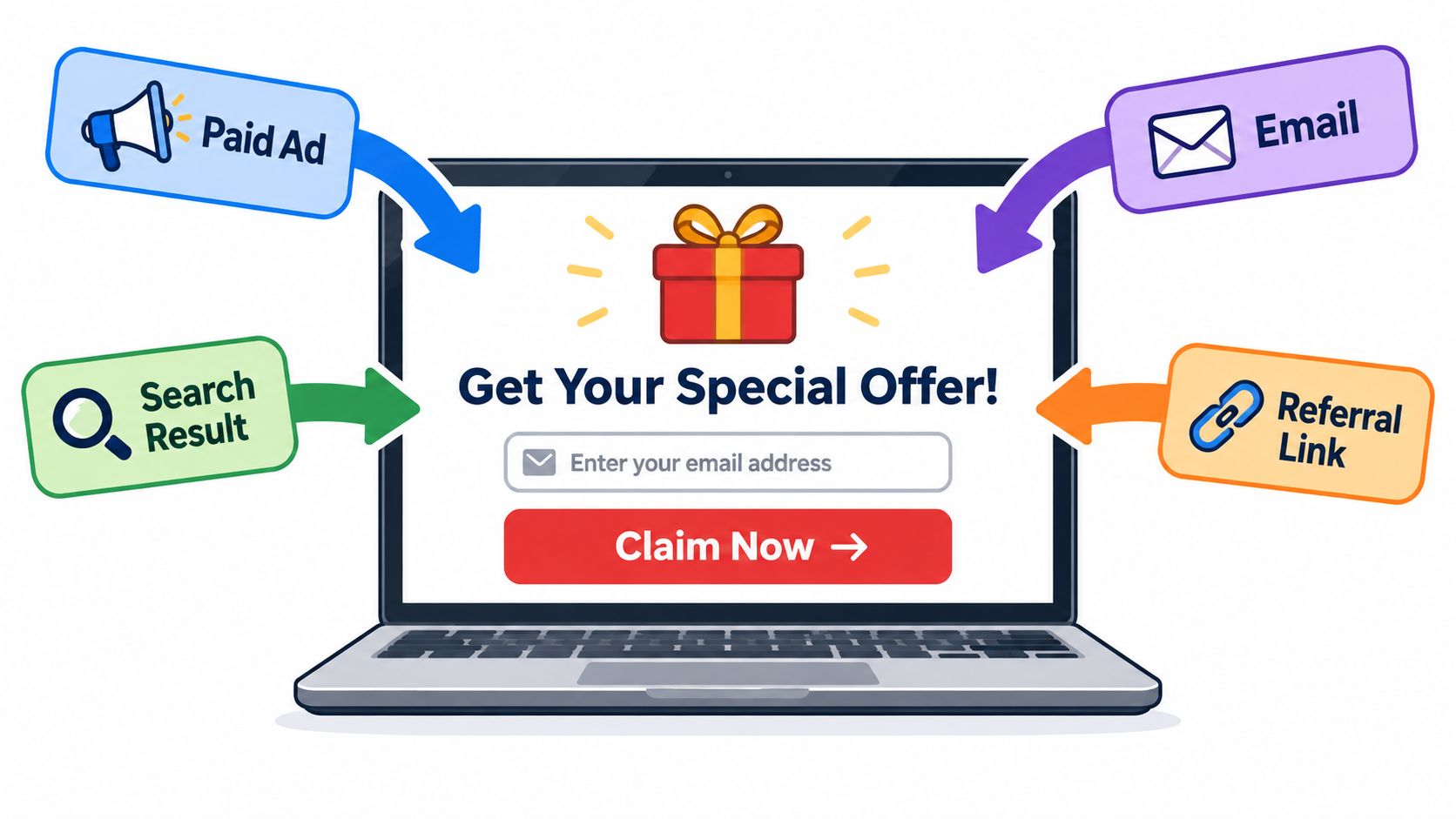
The three jobs the page has to do
Every landing page does three jobs at once, whether or not the person who built it thought about them.
- Match the promise. The headline, the image and the offer should resolve the exact expectation the ad, email or search result created. A visitor who clicked "redness in four weeks" and reads "clean beauty for everyone" leaves.
- Remove the exits. Navigation, related products, newsletter popups and social links all compete with the one action. Most of them go.
- Name the next step. One button, repeated, with a verb that describes what happens next rather than a vague "submit" or "learn more".
Say a skincare brand sells a $140 serum and runs a Meta ad about redness. Cold traffic from that ad shouldn't land on a product page with a shade picker and eleven related items. A pre-sell page in between can explain the formula, quote reviews from people with the same complaint, and answer the price objection before handing the visitor to the cart. Nothing about the storefront changes, which is the practical argument for keeping campaign pages separate: offer, proof and button all move without touching checkout.
The 30-second test: name where the visitor came from, name the one action you want, then read your own first sentence out loud. If it doesn't sound like the ad they just clicked, the page isn't finished.
Landing Page vs Homepage, Product Page and Advertorial
A shopper clicks a Meta ad for a specific serum and lands on the brand's homepage. The homepage may be well designed, but its broad menu and many product options do not match the focused reason for the visit. The same URL can serve as a homepage, product page or landing page depending on how visitors arrive and what they expect to do.
| Page Type | Typical Entry Point | Primary Goal | Navigation Level | Typical Example |
|---|---|---|---|---|
| Landing page | Paid ad, email, search result or referral | One action, such as a purchase or sign-up | Focused on the visitor's reason for arriving | Campaign page for a Meta ad |
| Homepage | Brand search or direct visit | Explore the brand | Full site menu | brand.com |
| Product detail page | Collection, search or internal link | Decide on one product | Cart, reviews and related items | Single product URL |
| Pre-sell page | Cold social ad or content click | Build intent before the product page | Minimal or none | Sales-style page explaining ingredients, reviews and objections |
| Advertorial | Cold social ad or content click | Educate before selling | Minimal or none | Article-style page explaining the product |
The entry point changes what visitors already know and what they need next. Someone searching for a brand may want to browse; someone clicking an ad for a serum may need details about that product and a clear way to buy.
The real difference is intent, not layout
A homepage welcomes visitors with different questions, so it offers broad routes through the brand. A product detail page focuses on one item and helps shoppers weigh its reviews, price and related options. A landing page is shaped around a particular source and the action that visitor came to take.
Pre-sell pages and advertorials both introduce an offer before the product page, but they present information differently. A pre-sell page uses a sales-oriented layout to explain ingredients, share reviews and address objections. An advertorial uses an article-like format, with an editorial-style headline and byline, to introduce the product through a story.
Two meanings of the same term
In web analytics, a landing page is the first page viewed in a session. In advertising, it is the destination a campaign click delivers people to. Adobe's explainer on landing pages distinguishes the analytics meaning from the conversion meaning and describes lead-generation and click-through pages.
That distinction explains why a quiz, checkout step or category page may count as a landing page in analytics without serving as a campaign landing page. To judge its role in a campaign, look at the entry source, the visitor's intent, the primary action and the event used to measure success.
The no-navigation rule needs a caveat
Removing every link can focus attention, but it can also leave visitors without answers they need. Google's 2025 update to its Search Ads systems weighs ad-to-page relevance alongside ease of use, link structure and whether the destination meets the ad's expectation, as Adobe's explainer describes. For an unfamiliar brand buying cold search traffic, links to sizing, shipping and returns can help address doubts. For a warm email list and a focused offer, those same links may distract from the intended action.
A page with zero links isn't disciplined. Sometimes it's just closed.
Use this rule when labels get confusing: if the page makes sense to someone arriving from an unrelated search, it likely serves a broad homepage role. If it makes sense because the visitor clicked a specific ad, it functions as a landing page. The design can stay the same; the source and intent define the page's job. A Best UGC Video Generator comparison guide can help marketers compare tools for creating video ads that send visitors to a campaign page.
The Parts Every Landing Page Needs
A landing page earns its result in the first viewport and then defends it, block by block. Here's the order a visitor meets those blocks, and what each one is there to do.
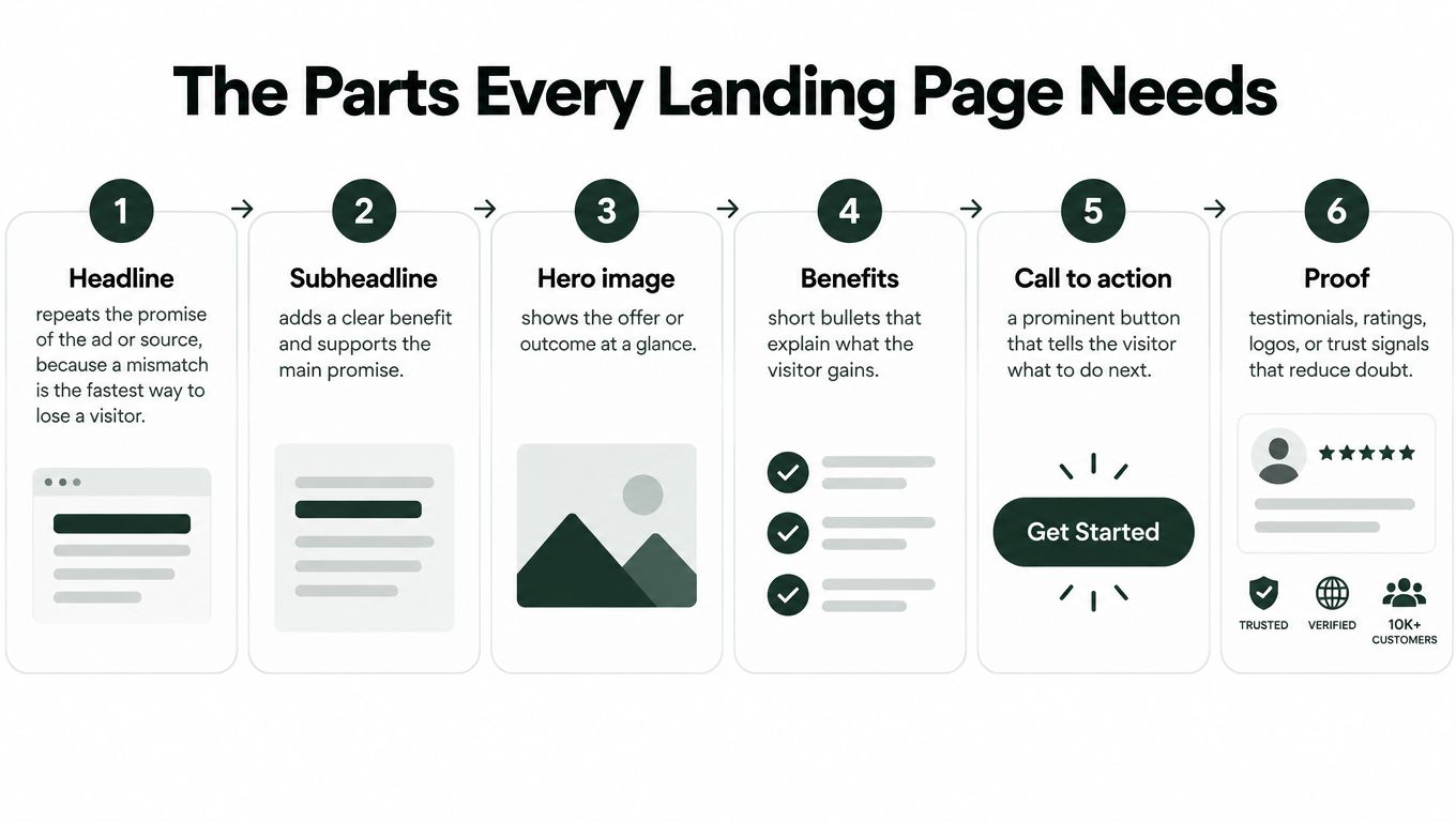
1. Headline. It carries the promise in the visitor's own words. If the ad said "redness in four weeks," the headline says redness in four weeks, not "clean beauty reimagined." This is the single fastest way to lose someone who just clicked.
2. Subheadline. One or two plain sentences covering what the product is, who it's for and what happens after the click. It exists to remove the need for a second of guessing.
3. Hero visual. The product in use, or the outcome. A serum bottle on a marble slab tells a visitor less than a face with visible redness before and after.
4. Primary call to action above the fold, then repeated after every major section with identical wording. Specific verbs beat generic ones: "Add the serum to my cart" outperforms "Submit" because it describes the consequence.
5. Proof. Reviews that name the same complaint the visitor has, ingredient sourcing, press mentions, subscriber counts. Proof placed next to the objection it answers does more work than a testimonial carousel at the bottom.
6. Objection handling. Guarantee terms, shipping window, a short FAQ, the answer to "why is this $140." Unanswered objections become abandoned carts.
Why the first screen decides the outcome
Mobile visitors scan before they commit to reading. Baymard's large-scale mobile usability research found 70% of test participants scrolled nearly the entire homepage just to understand what a site offered, while 42% of mobile homepages risked creating incorrect expectations about the product catalog, according to Baymard's mobile homepage benchmark.
The lesson is unglamorous. Make the ad-to-page transition explicit in the first screen, then order the sections by decision importance: what it is, who it's for, why it's credible, how it differs, what to do next. Brand storytelling comes after those questions are answered, not before.
Scan order beats story order. Assume nobody reads your second paragraph until the first one has already answered the question they clicked on.
If you want a walkthrough of the build itself, this short video covers the mechanics of putting those blocks together.
The mobile check before you publish
Test on a real phone, not a resized browser window. Thumb-sized tap targets, body copy readable without pinching, compressed images, few blocking scripts, and a button visible without scrolling back up. If a section only makes sense when read in sequence, rewrite it, because many visitors arrive mid-page from a scroll.
Length is a separate question with no universal answer. Extra persuasion delays the task for a warm visitor who already wants the product, while a cold reader may need education and proof before the button feels safe. Match length to traffic temperature, then change one variable per test. For a broader set of checks before you ship, Silva Marketing's landing page best practices covers the structural side, and this 2026 landing page optimization checklist is a useful pass to run right before launch.
Landing Page Types and How to Choose One
Four types cover most of what a DTC team ships. They differ by how warm the traffic is, how much the reader already understands, and what the page asks for.
| Page Type | Best Traffic | Reader Awareness | Primary Action | Typical Example |
|---|---|---|---|---|
| Lead-generation page | Warm or search traffic | Knows the problem | Form submission | Free guide sign-up |
| Click-through page | Warm traffic from email or ads | Knows the offer | Click to a next step | Webinar registration |
| Pre-sell advertorial | Cold, skeptical traffic | Aware of the problem, not the brand | Move to product page or checkout | Article that answers objections before checkout |
| Problem-led listicle | Cold social traffic | Aware of the problem, not the solution | Move to product page | Ranked list of fixes for a skin concern |
Choosing by awareness, not by page type
The common shortcut, listicles for warm traffic, gets the logic backwards. What decides the page is how much the reader already knows.
A lead-generation page assumes the reader can name their problem and will trade an email address for help with it. A click-through page assumes they know what's on the other side and just need the doorway: a webinar, a demo, a booking. A pre-sell advertorial assumes the opposite, that they've never heard of the brand, don't trust it and need the problem explained before price makes sense. Listicles split three ways: problem-led lists suit cold traffic, best-of lists borrow credibility from third parties, and product-led lists name the brand for readers who are already close.
Cold, expensive products reward education. An impulse, low-price, self-explanatory item often does better when the ad sends traffic straight to the product page, because a pre-sell page adds a step without adding information the buyer needs.
Judge the page by the move it makes, not by how it looks. One step closer to buying is a result. A prettier page that leaves the reader exactly where they were is not.
Four questions before you build anything
- Where does the traffic come from? One ad, one email segment, one search theme. If you can't name it in a sentence, you're building a homepage.
- How aware is the reader? Problem-aware, solution-aware or product-aware changes the opening line, not the button color.
- Which single action should this page drive? Buy, book, subscribe or click through. Two answers means two pages.
- Which event will measure it? Purchase, form submission, qualified lead or downstream revenue. Pick it before design starts.
If the build itself is the bottleneck, Landra's generator takes a store URL and produces four page types from it: the AI Advertorial Generator, the AI Listicle Generator, the AI Presell Page Generator, and Advertorials for Paid Social tuned for cold Meta and TikTok traffic. You paste a brand URL, generate the draft, edit it, publish. For a sense of what finished pre-sell pages look like across categories, Landra's ecommerce landing page breakdown walks through the structures that repeat.
Choose by awareness first, then judge the page on whether it moves people one step closer to buying.
Measuring Whether a Landing Page Works
A visitor arrives from somewhere with a reason to click. Measure whether the page helps that visitor take the intended next step, then check whether that step benefits the business.
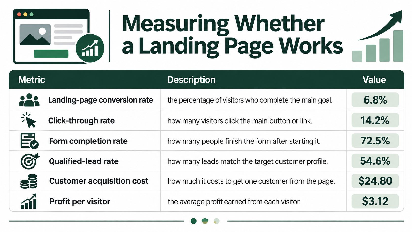
| Metric | What It Tells You |
|---|---|
| Landing-page conversion rate | Share of visitors who complete the target action |
| Click-through rate | Share of visitors who click the main call to action |
| Form completion rate | Share of started forms that are submitted |
| Qualified-lead rate | Share of leads that become real prospects |
| Customer acquisition cost | Ad spend per paying customer |
| Profit per visitor | Margin earned from each visit |
Choose the metric that matches the page's job. For a product page, that may be purchases; for a lead-generation page, it may be qualified form submissions. A click on the call to action can show where visitors lose interest, but it does not prove they completed the purchase or became a qualified lead.
Why two averages can both be right
Conversion benchmarks can look far apart because they may count different actions, traffic sources, page types, and industries. A lead-form submission is not the same outcome as a purchase, just as visitors arriving from a focused email may have different intent from people clicking a broad ad.
Use benchmarks as context, not as a pass-or-fail target. Compare pages with the same conversion event, similar traffic intent, and comparable offers. Otherwise, a difference in audience or goal can look like a design win.
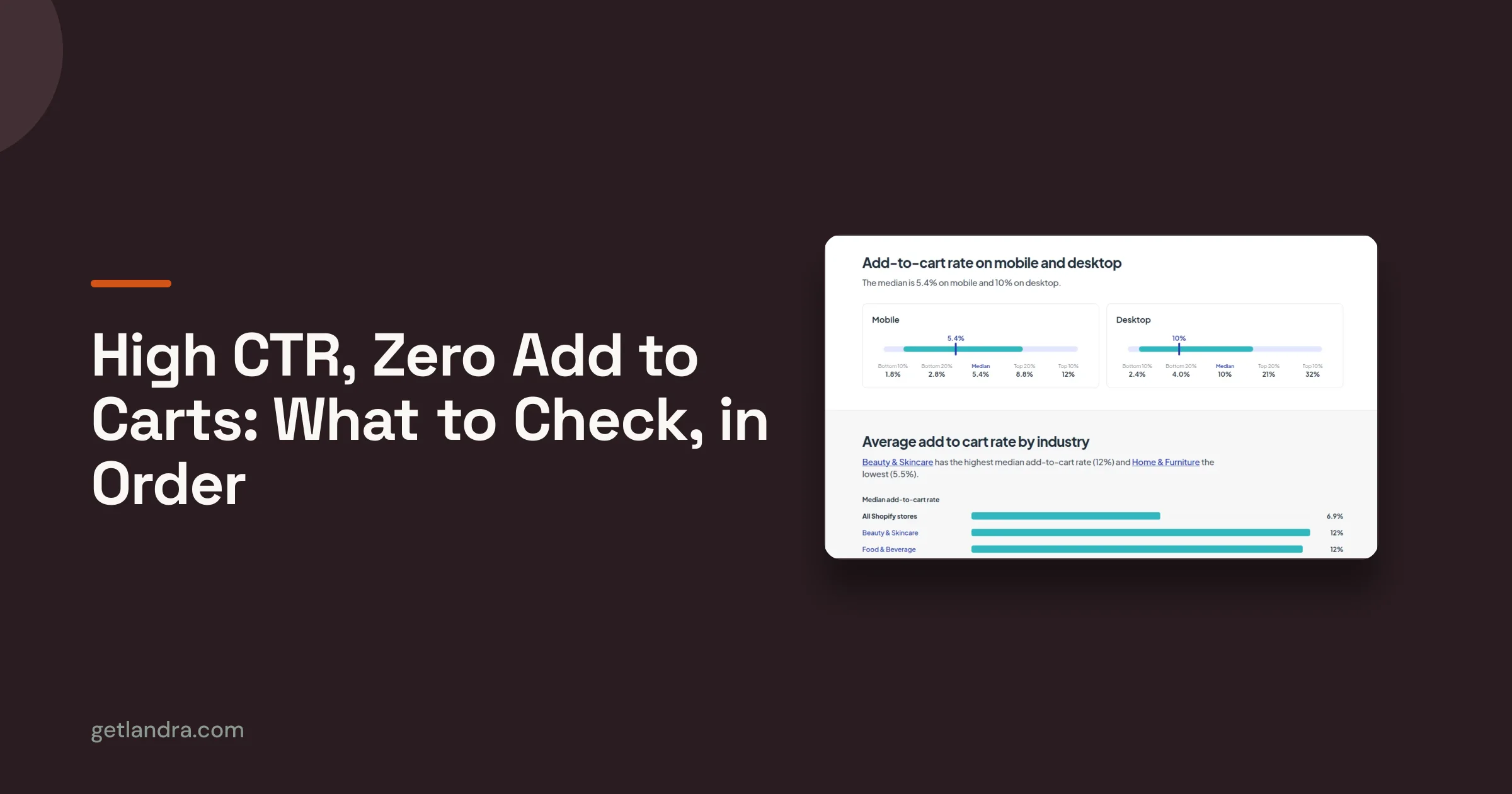
Speed and device fit affect the experience a metric records. A slow page may lose visitors before they see the offer, while a layout that is difficult to read on a phone can interrupt the path to action. Check performance by device as well as overall.
A benchmark only means something when the conversion event, the traffic source and the offer match yours. Otherwise it's a number from someone else's business.
For DTC brands, profit per visitor beats conversion rate
A higher conversion rate does not automatically mean a more profitable page. If a discount drives extra orders but leaves too little margin, the page may convert more visitors while earning less.
Track customer acquisition cost and profit per visitor alongside conversion rate. A simple way to frame profit per visitor is revenue per visitor minus the costs attributed to each visitor, including ad spend. The CVR calculator for paid social helps work out conversion rate; use your own margin figures to understand what those conversions are worth.
Build and Test Your First Landing Page
Pick one product and one traffic source, then build the smallest page that can prove something. Six steps, in order.
- Choose the pairing. One product, one source. A single Meta ad, or one segment of your email list. Not "paid social" as a category.
- Write the first screen to the ad's exact promise. Use the ad's own words for the headline and subheadline, so the click resolves rather than restarts the conversation.
- Assemble in scan order. Proof next to the objection it answers, then one primary call to action repeated after each major section with identical wording.
- Test on two real phones over a slow connection. Read the page without pinching or scrolling sideways, then ask someone else to do the same while you watch.
- Instrument the step before the goal. If the goal is a purchase, track add-to-cart and checkout initiation too, otherwise a drop-off at checkout looks like a page problem when it's a shipping-cost problem.
- Run a fair test. Current page as control, new variant as challenger, same traffic, fixed period agreed in advance. Compare conversion rate and profit per visitor, not clicks.
How to read the result without fooling yourself
Traffic changes week to week, so a fixed window decided in advance protects you from stopping the test the first day your variant leads. Look at profit per visitor alongside conversion rate, and check the mobile split separately, since desktop and mobile visitors behave differently enough that an aggregate number can hide a mobile page that isn't working.
If the variant wins, keep the control running for another period before deleting it. If it loses, read the scroll depth and the click-through rate on the button, because a page people finish reading but don't act on has a proof problem, while a page nobody finishes has an opening problem.
The question to hold onto is the one from the beginning: does the page deliver the promise that brought this person here, and does it make the next credible action obvious? Everything else, layout, color, section count, is a detail in service of that.
Landra takes a product or brand URL and generates an editable advertorial, listicle or pre-sell page, then publishes it to a Landra hosted link, straight to Shopify, or as clean HTML you can run on your own domain. That gives you a campaign page to test against your product page in an afternoon instead of a sprint, without touching your storefront theme or checkout flow. Paste your store URL, generate a draft, and rewrite the headline and proof until the first screen matches the ad sending people there. Start with Landra.