

In 2025, about 6 billion people, 74% of the world's population, were online, up from 5.8 billion in 2024, according to the International Telecommunication Union. The screen most of them hold is a phone. Not a laptop on a desk, not a 27 inch monitor.
That single fact explains why mobile first design became the default starting point for anyone building a page that has to convert. It also explains why so many mobile pages still disappoint. When you treat a phone as a smaller desktop, you produce something that technically loads on a handset and practically fails on one.
This guide treats mobile-first as two disciplines most tutorials skip: a performance budget and an accessibility standard. The breakpoints are the easy part.
Table of Contents
- Mobile First Design Explained in Plain Terms
- Five Principles Behind Every Mobile-First Layout
- How Mobile-First Changes Layout, Navigation and Forms
- Performance Targets a Mobile-First Page Must Meet
- Accessibility Checks Mobile-First Guides Often Skip
- A Mobile-First Presell Page Worked Through Step by Step
- Test Your Mobile-First Design Before You Publish
Mobile First Design Explained in Plain Terms
The crossover that made this mainstream happened years before that 2025 count. StatCounter reported that mobile and tablet internet usage exceeded desktop usage worldwide for the first time in November 2016. From that month onward, designing for a wide screen first meant designing for the smaller share of visitors, and every layout decision inherited the assumption that the phone was an afterthought.
The image below is the short version of the argument: the phone on the podium, the desktop left behind.

So what does the term mean? Mobile-first design means starting the layout on the smallest screen, deciding what matters most, then adding detail as space grows. It's the carry-on rule of packing. You fit the essentials into the bag you'll carry on, and you add extras only if there's room. Desktop-first packs the suitcase first and then tries to squeeze it into the overhead bin.
| Design Question | Desktop-First Approach | Mobile-First Approach |
|---|---|---|
| Starting screen | Wide canvas, then shrink | Smallest viewport, then expand |
| Content priority | Everything visible at once | Decide the one key message first |
| Navigation | Full menu across the top | Compact menu or essential links only |
| Interaction | Hover and precise mouse clicks | Thumb-sized touch targets |
| Network assumption | Fast, stable connection | Variable signal and data limits |
Two terms get mixed up here, and the confusion costs teams real time. Responsive design is the technique that rearranges one layout across screen sizes. Mobile-first is the order of decisions that produces that layout. You can build a responsive site desktop-first. Both use breakpoints. Only one decides content priority before it decides columns. If you want the concept narrated from scratch, Bruce and Eddy's explanation of designing for small screens first walks through the same shift without jargon.
The decision sharpens further when the page is a presell rather than a storefront, which is why choosing a design approach for presell pages is worth reading before you pick a template. Here's a self-check you can run in thirty seconds: open your homepage or landing page on your phone and ask whether the first screen answers the visitor's main question without scrolling or zooming. If it doesn't, the page was built the other way round.
Five Principles Behind Every Mobile-First Layout
In a Nielsen Norman Group study that put 48 people in front of websites on their own phones, 33 in the United States and 15 in London, average task success on mobile was 59%, against roughly 80% on desktop. Participants succeeded 64% of the time on sites built specifically for mobile, versus 53% on the same content in its full desktop form. That 11-percentage-point gap is the case for a phone layout in one comparison. Shipping the desktop page onto a small screen is a different job from designing the page for that screen.
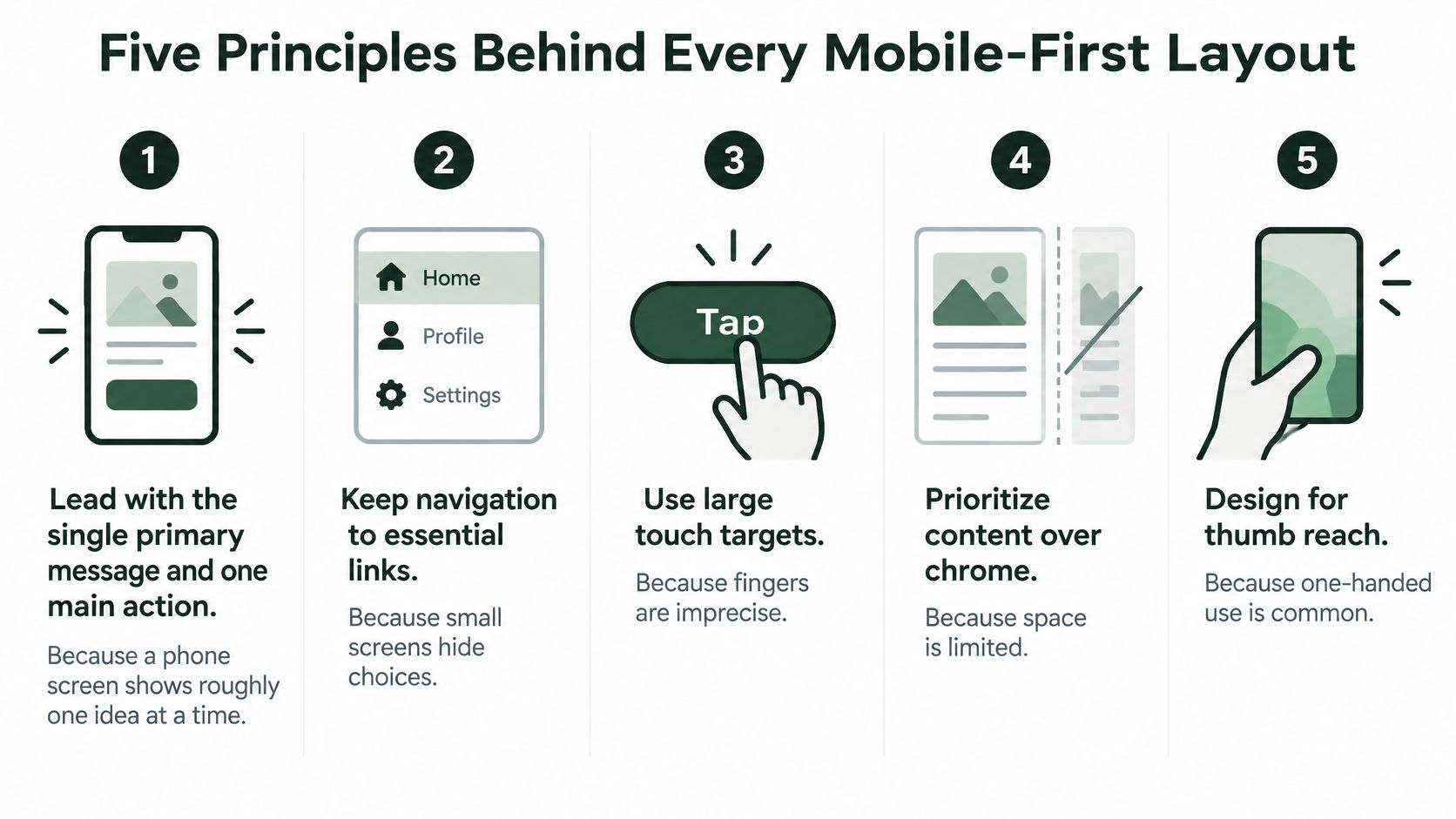
Tooling changes every year. The checks under a layout that still works on a thumb and a patchy signal do not. Five of them explain almost every failure you will find, and they are performance and accessibility checks, not only places to insert a breakpoint. Guides that stop at "stack the columns" skip these.
- Lead with one message and one action. A phone shows roughly one idea at a time, the way a shop window shows one offer rather than the whole stockroom. The first screen gets one promise and one obvious next step. Add a second competing offer and neither gets read.
- Size touch targets for thumbs, not cursors. Fingers land imprecisely, and they cover what they touch. Give interactive elements generous height and space them apart, because a tap that hits the wrong control costs more than the two seconds it appears to save. Teams often file this under visual polish. It is also the check that keeps a control usable for a shaky hand or a person mid-stride.
- Keep body text readable without pinch-zoom. Zooming breaks the reader's place in the page and often hides the button they need. Comfortable type on a narrow column beats elegant small type every time.
- Eliminate horizontal scrolling. Sideways movement hides content off the right edge, where many visitors never look, and it fights the browser's own back gesture. If a sentence only finishes after a sideways drag, the smallest screen has already failed.
- Cut what serves no task on the small screen, and defer the rest. Every element costs bandwidth and attention. An expandable block can hold the depth for motivated readers without charging everyone for it upfront. On a variable connection, that cut is a load-time decision, not a matter of taste.
Here's a visual summary of the same set.
Google later made mobile-friendliness an explicit ranking signal, favouring pages with text readable without zooming, tap targets spaced for thumbs, and no horizontal scrolling, so usability and search performance became linked concerns.
If a principle can't be checked on a real phone, it's a preference, not a principle.
For a small business site rather than a presell page, DesignStack's guide to mobile website design for UK SMEs applies the same checks to a brochure-style build.
How Mobile-First Changes Layout, Navigation and Forms
A desktop page shrunk down keeps its structure and loses its usefulness. Three structural decisions do most of the repair work, and Nielsen Norman Group's research library on mobile and tablet design treats each of them as a distinct usability problem rather than a styling task.
Navigation shrinks to the next step
A twelve-item top menu works on a wide screen because everything is visible at once. On a phone that menu becomes a crowded strip or a hidden drawer, and either way the visitor is now hunting. Keep a short list of essential links, one clear menu control, and an always-available path back to the main action. The test is simple: from any scroll position, can someone get to the next step without opening a menu?
Forms ask only for what the action needs
Every field you add loses completions. Trim to the fields required to act, then match the input to the keyboard it should raise: an email field that opens the email keyboard with the @ key visible, a phone field that opens the numeric pad, a card field that supports scanning. Put labels above the fields so they stay visible while typing, and never let placeholder text stand in for a label, because it vanishes the moment someone starts entering data.
Breakpoints follow the content, not the device list
Widen the page slowly and watch for the first point where it breaks: a headline wraps into an orphan word, a comparison block squeezes its columns, an image distorts. That width is your breakpoint. Device names change every year and the content doesn't.
Progressive disclosure is the pressure valve. Show a short summary of a benefit or an ingredient, then let motivated readers expand the full explanation. The trade-off is real: content hidden behind a tap gets missed by skimmers, and by search engines if it never renders. Keep the decision-critical facts visible and hide only the depth.
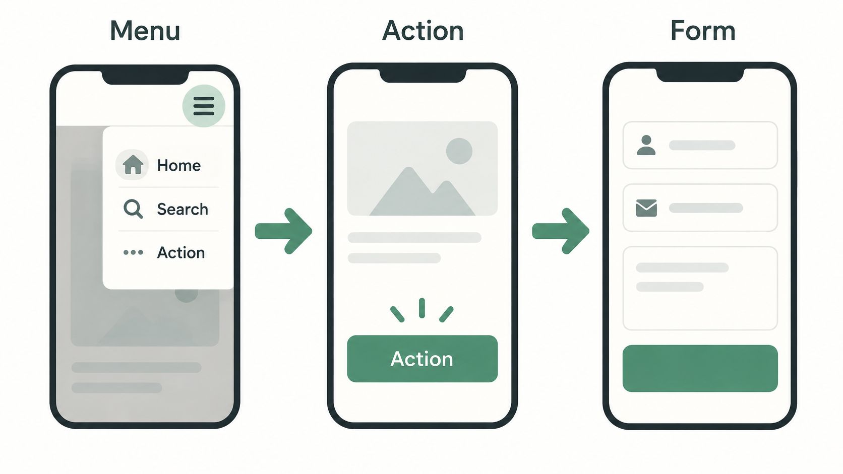
The walkthrough below shows the same flow in motion, from menu to action screen to form.
Run this on a real handset in portrait and rotated orientation: tap every control with a thumb, read the longest headline aloud without zooming, scroll to the bottom looking for sideways movement, and fill the form once with autofill off. Anything that fails is a fix, not a nitpick.
Performance Targets a Mobile-First Page Must Meet
A page can fit a phone screen and still feel broken. If the hero image appears late or a tap takes too long to respond, visitors experience a performance problem, not a layout problem. Performance is part of mobile-first design.
Three field metrics help describe that experience. Largest Contentful Paint (LCP) tracks when the main headline or hero image appears. Interaction to Next Paint (INP) measures how quickly a page responds to a tap or click. Cumulative Layout Shift (CLS) measures whether content jumps as the page loads, potentially sending a tap to the wrong place.
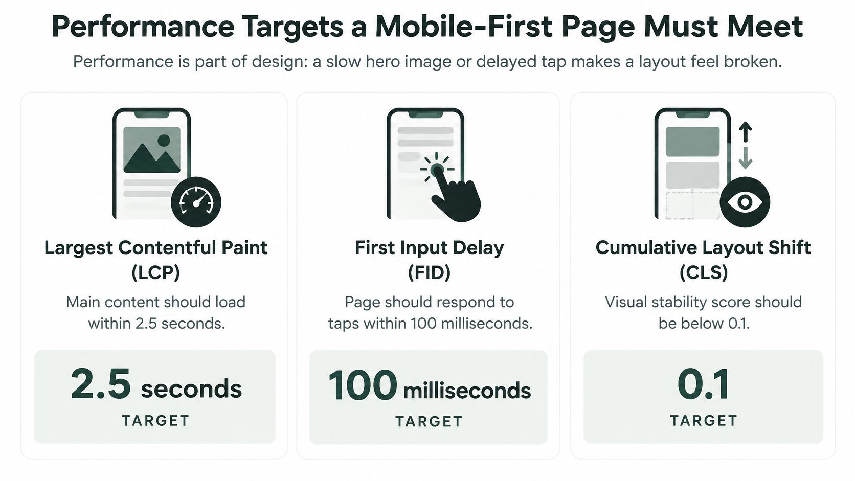
The 2025 Web Almanac defines a “good” result using the 75th percentile of real-user loads. These thresholds show what that means:
| Metric | What It Measures | Good Threshold | 2025 Pass Rate |
|---|---|---|---|
| Largest Contentful Paint (LCP) | When the main headline or hero image appears | 2.5 seconds or less | 57% mobile vs 68% desktop |
| Interaction to Next Paint (INP) | How quickly taps and clicks respond | 200 milliseconds or less | 77% mobile vs 97% desktop |
| Cumulative Layout Shift (CLS) | Whether content jumps while loading | 0.1 or less | 83% mobile vs 86% desktop |
| All three metrics | Passing every threshold together | All thresholds met | 48% mobile vs 56% desktop |
In 2025, 48% of mobile websites met all three thresholds, compared with 56% on desktop. The interaction gap was larger: mobile INP was good on 77% of sites, versus 97% on desktop, according to Publift's Core Web Vitals breakdown. A page may appear lightweight yet still delay taps. Large hero images, carousels, tracking scripts, personalisation and embedded reviews can all add work for the browser.
Practical rule: prevent layout shifts first. When content jumps, visitors can tap the wrong control.
Start by reserving space for images and embeds, so the page does not rearrange when they load. Size and compress hero media for mobile rather than sending a desktop-width image to a phone. Defer scripts that are not needed for the first interaction, and check that third-party widgets do not block it. Then assess performance using real-user mobile data at the 75th percentile, rather than relying only on a fast developer device.
A before-and-after comparison makes a performance check more useful: compare the page with its earlier version, or use another page as a reference. 99tests documented how our site performed in India, offering an example of a website check for comparison. For practical guidance on the metrics and fixes, read Landra's guide to faster mobile pages.
Accessibility Checks Mobile-First Guides Often Skip
A layout can reflow to every phone width and still shut someone out. Zoom the text to 200 percent, switch on a screen reader, or hold the phone in bright sun, and the same "mobile" page often fails the person using it. Breakpoints only answer whether the columns fit. Accessibility asks whether the content still makes sense when sight, motion, or a mouse is limited.
In February 2025, 94.8% of the top one million homepages failed at least one WCAG accessibility criterion, and low-contrast text affected 79.1% of them, according to Figma's web design statistics. Responsiveness was never the measure.
Stacked columns and larger tap areas are the checks most guides stop at. The six below are the ones they skip. Each one is a failure you can reproduce on a phone in a few minutes.
- Semantic heading order. A screen reader user moves by jumping between headings, the way a sighted reader scans the bold lines. If H2s and H3s are picked for font size rather than structure, the page reads as a flat wall. Use one H1, then nest H2s and H3s in order, even when the mockup makes a smaller heading look "too big."
- Descriptive alternative text on hero and proof images. "Image" tells someone nothing. A review screenshot needs its content written out, because the reader can't see the stars. Write the claim the photo is there to prove, in one plain sentence.
- Trust signals that don't rely on colour alone. A green checkmark means nothing in greyscale or to a colour-blind visitor. Pair it with a text label, and give star ratings a written value. Colour can support the label. It cannot stand in for it.
- Contrast strong enough for sunlight. Muted editorial grey on white reads as tasteful on a studio monitor and as invisible on a phone held outdoors. Small text needs more contrast, not less. If you squint at it indoors, that grey will vanish on a pavement at noon.
- Labels that stay visible while the form is filled. Once a placeholder disappears, the field loses its name. Keep a label above the field so a shopper who looks away, and a screen reader that never saw the placeholder, still knows what to type.
- Reduced-motion behaviour for animated sections. Respect the system setting. A parallax hero that triggers nausea is a conversion problem too. When the device asks for less motion, show a still frame instead of the animation.
Tiny type, low-contrast styling, image-based proof and swipe-only carousels all look clean in a mockup. They also block the same visitor who needs to understand the offer and reach checkout.
Ask whether a first-time visitor using assistive technology can understand the promise, weigh the evidence, and reach the action without losing their place.
A Mobile-First Presell Page Worked Through Step by Step
Say a shopper taps a paid social ad for a $140 skincare device. She lands on the product page, which the brand designed on a 27 inch monitor. On her phone it opens with a wide lifestyle photo, a headline that wraps to five lines, a carousel of six images, and a "Shop now" button below the fold. It's complete on desktop and cramped on mobile.
The first screen earns the scroll
The mobile-first version opens with one promise in a short headline, the product shot centred and sized in advance, and a single action. Because the image has reserved dimensions, the headline doesn't jump when the photo finishes downloading. She reads the promise before her thumb moves.
Proof arrives before persuasion
Next comes a short review excerpt with a written star rating and one button to read more. The tap target is full width with space above and below, so it doesn't sit against the next link. This is the touch-target principle doing quiet work: she isn't asked to be precise with a thumb on a moving bus.
The ingredient panel moves behind an expandable block. Skimmers get the summary; motivated readers get the detail. That's progressive disclosure, and it keeps the initial render light without hiding anything decision-critical.
The tap that fails on a slow phone
Here's where the story usually ends badly. On a mid-range Android phone over a patchy connection, the hero image loads late, a chat widget and two tracking scripts block the main thread, and her first tap on the button does nothing for a second and a half. She taps again, the page finally responds, and she's now on a screen she didn't intend. Nothing in the design critique would have caught this. Only field data on a real device would.
Each fix maps to something already on the page's spec sheet: the reserved dimensions protect layout stability, the compressed hero protects paint time, the deferred scripts protect the tap. Each is measurable in the same report the team already reads, segmented by device.
The uncomfortable part: the same page can score well on a fast laptop and still be unusable on the phone that most of the ad traffic arrives on.
Test Your Mobile-First Design Before You Publish
Run this as an ordered go or no-go gate, not a vibe check. Six steps, in this order, on a real device.
- Open the page on a mid-range phone in portrait and wide orientation. Confirm the first screen states the main message and shows exactly one action.
- Pull LCP, INP and CLS from field data at the 75th percentile. Lab scores on a developer machine flatter every page. Each metric has to clear the threshold you set for it.
- Tap everything with a thumb. Log mis-taps, cramped targets, and any control sitting close enough to body text that a scroll turns into an accidental click.
- Turn on a mobile screen reader and listen to the page in sequence. Heading order and image descriptions should make sense read aloud, with no orphaned labels.
- Load the page on a throttled connection and watch which section arrives last. Then check whether that section delays the action.
- Record results by device, connection and scroll depth. A test you can't compare against the next one tells you nothing.
That last step is where teams get lazy. Segment the same page by device model, connection type and how far people scroll before they act. Heat map analysis for landing pages shows where attention lands, which is a useful check against your assumptions about where the button should sit.
If you're generating pages rather than hand-building them, the setup matters for how fast you can iterate: on Landra you paste a store or product URL and the page generates from it, with the option to add an audience and angle when you want more control over the angle being tested.
Go or no-go: publish only when the first screen, the primary action and all three speed targets pass. Everything else gets logged and fixed after launch.
Landra turns a product or store URL into an editable, mobile-first pre-sell page, so the first screen, the main action and the performance budget are structured before you write a word of copy, and a conversion-optimized page builds in about two minutes. You can publish to Shopify, a hosted Landra URL, Webflow or an HTML export, then run the six-step gate above on a real phone and fix what fails in the same editor. Start with Landra and take your first page live today.