
The fastest way to learn what makes a listicle landing page convert is to read pages that already do. Below are seven live DTC examples (links current as of June 2026), each torn down for the one technique it executes best — and how to copy it. Open them in a new tab as you read. New to the format? Start with what a listicle is; ready to build one, see how to write a high-converting listicle.
What is a listicle landing page?
A listicle landing page is a pre-sell page that makes its case as a ranked, numbered set of reasons — "5 Reasons Why…" — built to be scanned rather than read. It's not a blog listicle (that's editorial content) and it's not a long-form advertorial (that's narrative prose). It's the scannable cousin: a warm shopper lands, skims the numbered reasons, and clicks through to buy.
The format works because people scan — Nielsen Norman Group's eye-tracking research documents a "layer-cake" pattern where readers lock onto headings and skim the body between them. A numbered list is built for exactly that.
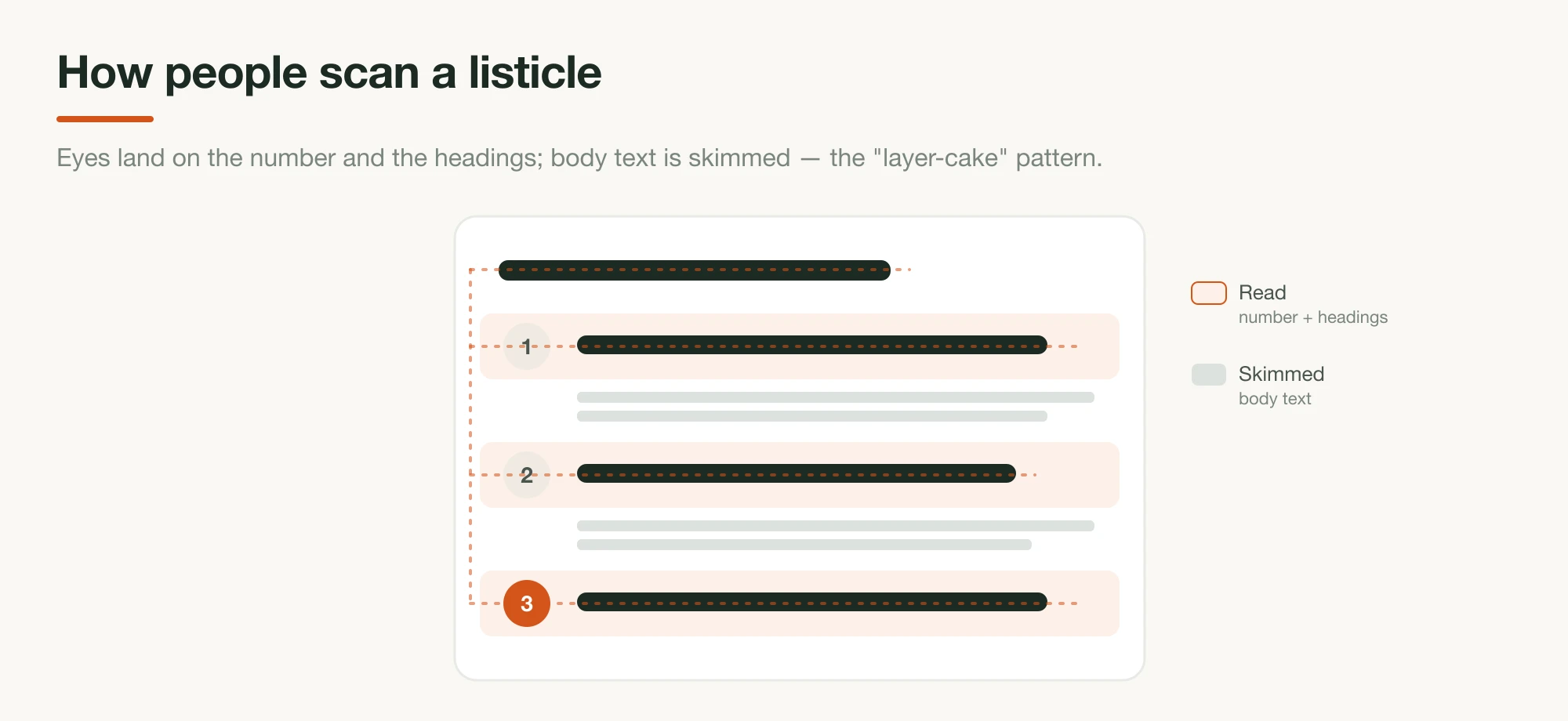
Underneath the scannability are two well-documented mechanics. There's chunking — breaking a dense case into discrete, labeled reasons makes each one easier to process and compare, and a reader who bails after reason three still absorbed three reasons to buy. And there's closure: a number in the headline promises a finite, knowable payoff, which is part of what earns the click. (You'll also see vendor claims that listicle headlines lift click-through — Anyword has reported a 70% CTR lift in its own tests — but read those as directional, since they're self-run and measure ad headlines, not page conversion.)
The examples below all exploit that behavior; what separates them is the technique layered on top.
7 listicle landing page examples, torn down
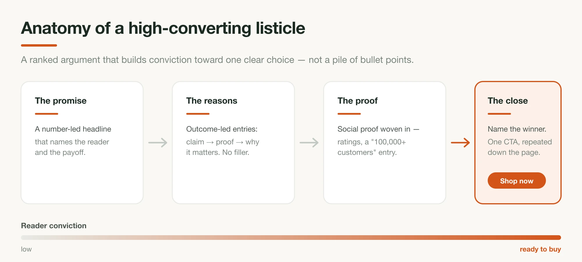
Each is a real page, captured June 2026 (open the links to see them live). For every one, note the single repeatable move — that's the part you can take to your own page. Underneath the variety, they share one anatomy:
1. HexClad — social proof in the headline
HexClad's "5 Reasons" page opens with the number baked into the proof: "5 Reasons 1,000,000+ Home Chefs Are Making The Switch." The reasons run from "cook a whole meal in one pan" to "trusted by Michelin-starred chefs" to "backed by a lifetime warranty," with the Gordon Ramsay endorsement placed inside a specific reason rather than as a decorative logo strip.
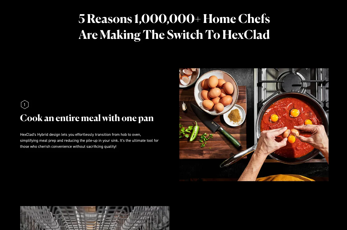
The move: put a customer count or review number in the headline itself. You never have to choose between a hook and proof — one line does both, and the number raises credibility before the first reason lands.
2. Caraway — lead with the category's #1 objection
Caraway's "5 Reasons You'll Love This Bakeware Set" opens reason one on "non-toxic ceramic coating" — directly answering the biggest objection in DTC cookware (Teflon and PFAS anxiety) before any aesthetic or convenience point. Reason five is a 30-day risk-free trial, and the page carries a high rating from tens of thousands of reviews.
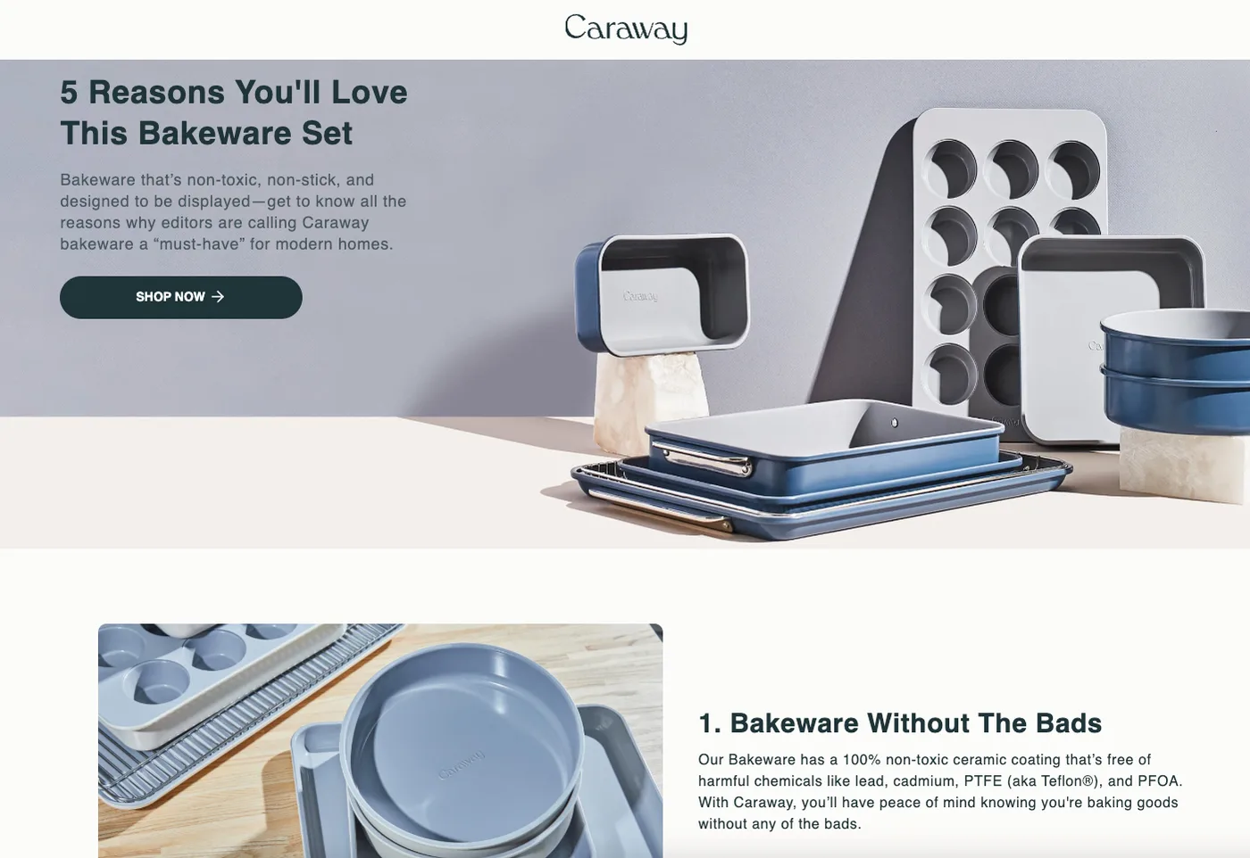
The move: make reason one the answer to your category's biggest objection. Don't bury the deal-breaker question — answer it first, then spend the rest of the list on desire.
3. Jones Road Beauty — put the audience in the headline
Jones Road's "5 Reasons Why Jones Road Beauty Products Are Great For Mature Skin" names its reader in the title. "Mature skin" is a self-selecting filter: anyone who identifies with it arrives already half-convinced, and anyone who doesn't bounces — which is exactly what you want. Reasons counter the two big prestige-brand objections (founder credibility via Bobbi Brown; "not heavy or cakey"), backed by press logos and review quotes.
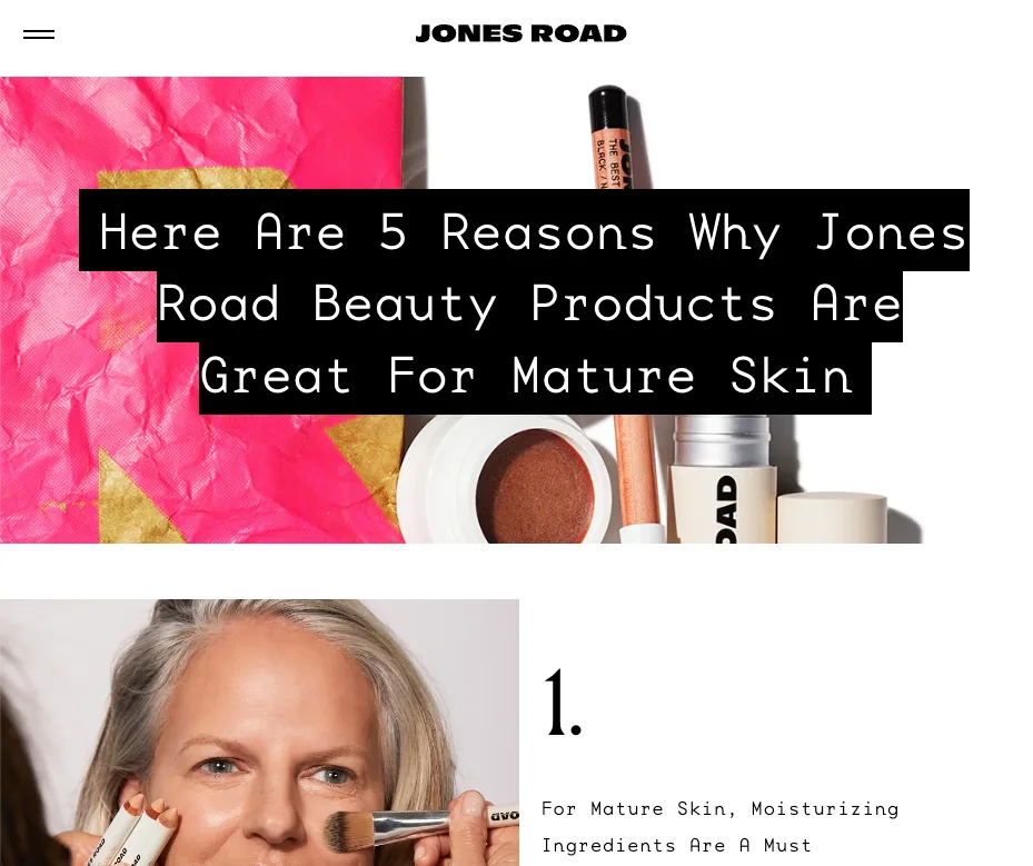
The move: name the specific audience in the headline. A page that speaks to "mature skin" or "new dads" or "first-time buyers" converts that segment far better than one that speaks to everyone.
4. Venus ET Fleur — answer the objection in reason one
Venus ET Fleur's "5 Reasons the Mini Le Plein Makes the Perfect Gift" opens on the single fact that kills the biggest objection to buying expensive flowers: they last over a year. The page never has to revisit "won't they die in a week?" — reason one settled it. Scheduling and personalization follow as emotional selling points, not fulfillment details.
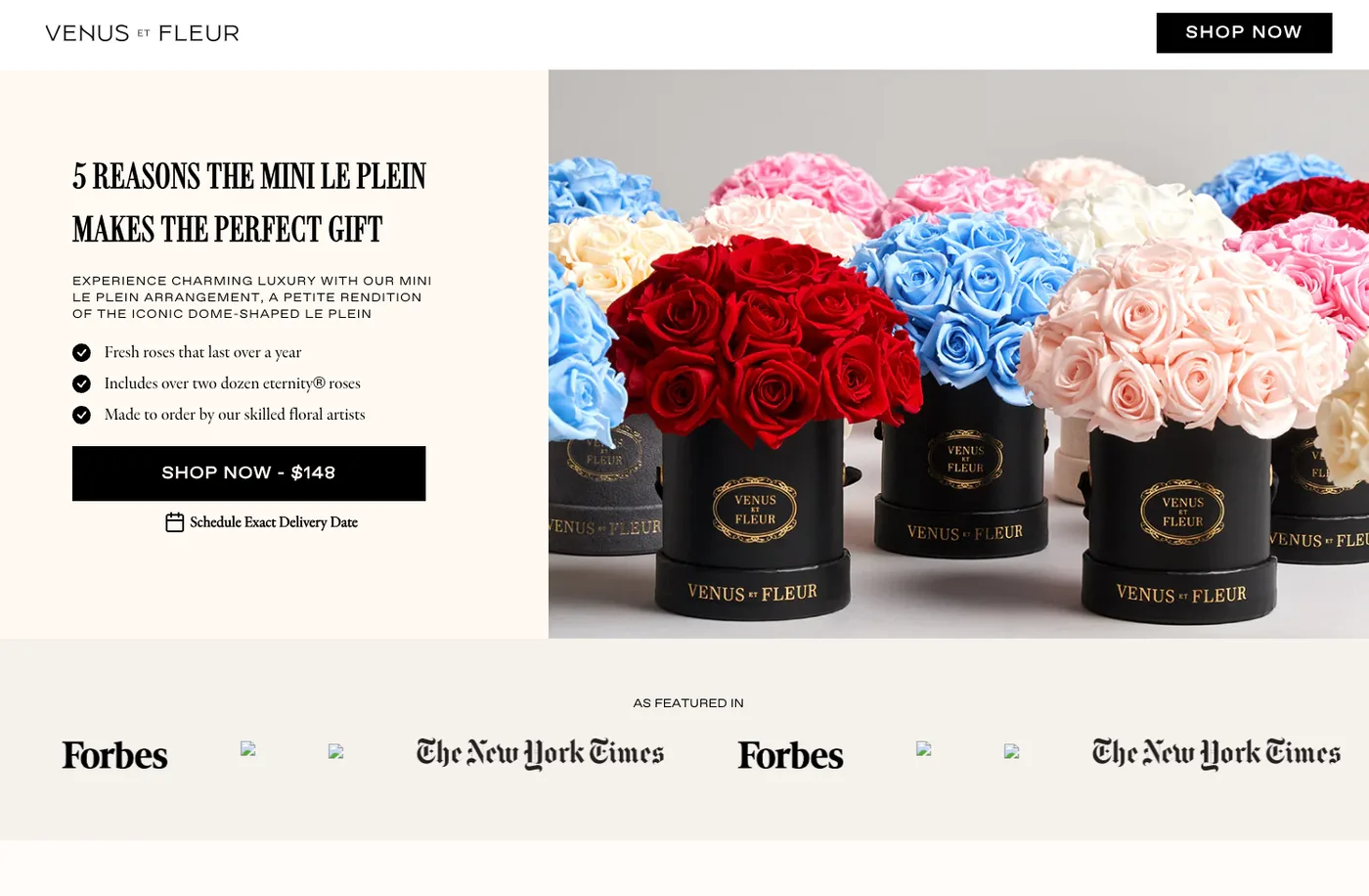
The move: if your product has one differentiator that defeats the category's main objection, make it reason one and state it plainly. Don't make a skeptical reader hunt for it.
5. Miracle Brand — break the pattern with one fear-based reason
Miracle Brand's "6 Reasons Americans Are Switching to These NASA-Inspired Sheets" (its Miracle Made sheets) stacks positive benefits — temperature regulation, less laundry — then interrupts the rhythm with reason three: "Your Sheets Are Damaging Your Skin," backed by an in-reason research citation. The fear-based reason mid-list re-engages a scanner who was coasting, and the "NASA-inspired" hook borrows authority without claiming an endorsement.
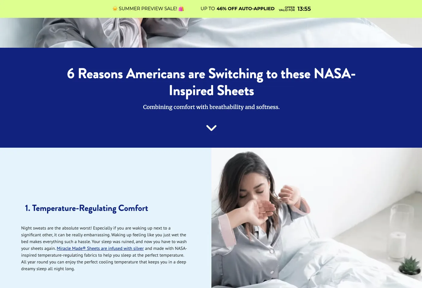
The move: drop one tension-based reason into a list of positives. A single "here's what's going wrong right now" line breaks the monotony and pulls a skimming reader back in — used once, honestly.
6. Obvi — turn the guarantee and the offer into reasons
Obvi's "10 Reasons Why Burn Elite Is Your All-In-One Beauty & Metabolism Solution" runs an unusually long list — ten reasons — likely because the supplement category is high-skepticism, where a longer list signals thoroughness. Tellingly, reasons nine and ten are the money-back guarantee and the current offer: close mechanics normalized as reasons rather than tacked on as footer fine print, alongside a 500,000-customer proof point and a member community.
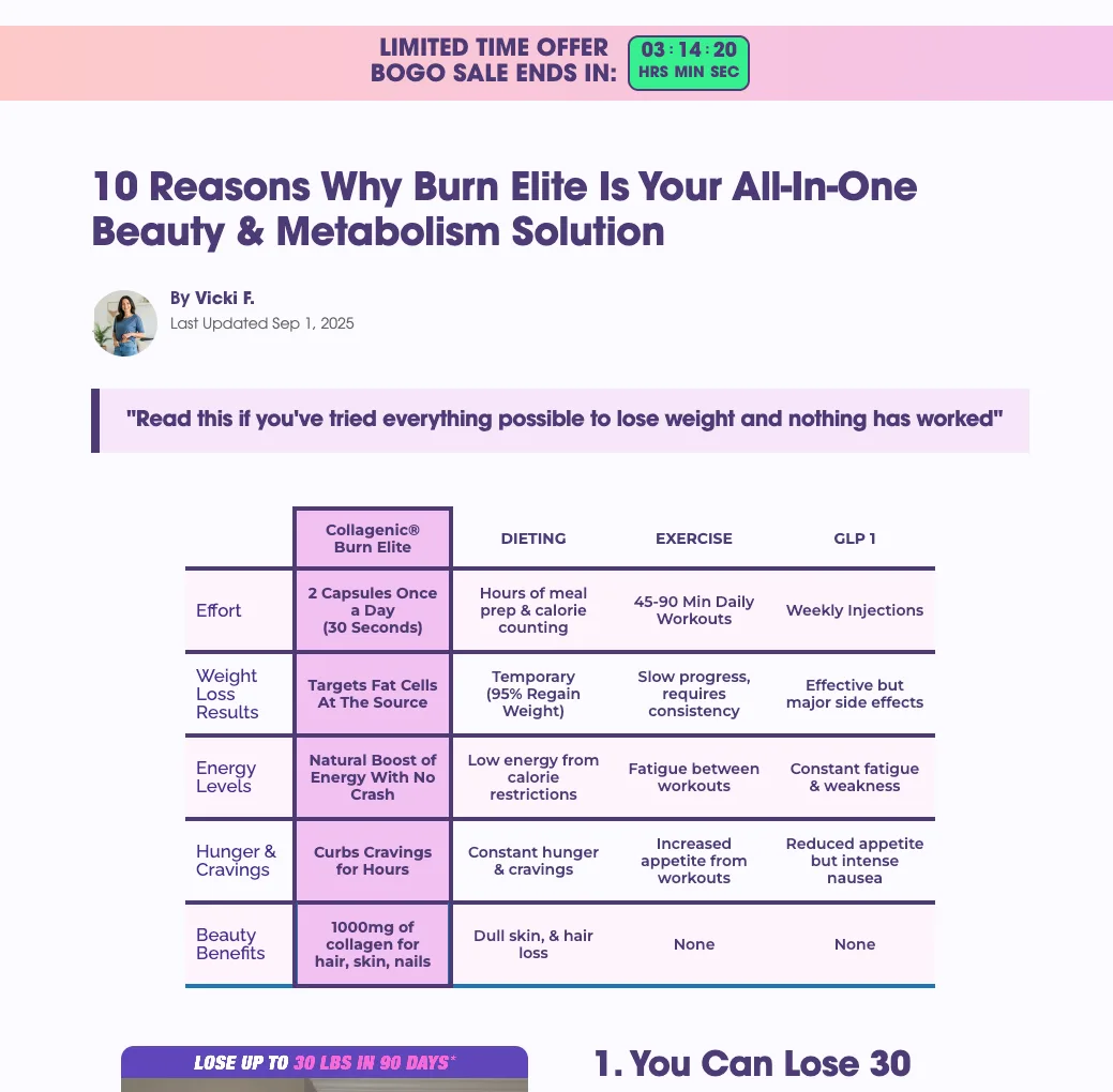
The move: make your guarantee and your offer numbered reasons. Inside the list they read as benefits; in the footer they read as fine print. The same fact persuades more in the right slot.
7. Perfy — make one reason about identity
Perfy's "5 Reasons Why Perfy is The Perfect Soda" stacks taste, clean ingredients, nootropics, and keto-friendliness — then closes the list with reason five: "soda for people who don't drink soda." That line isn't a product claim; it's an identity statement that reframes the category objection ("I don't buy soda") into the reason to buy.
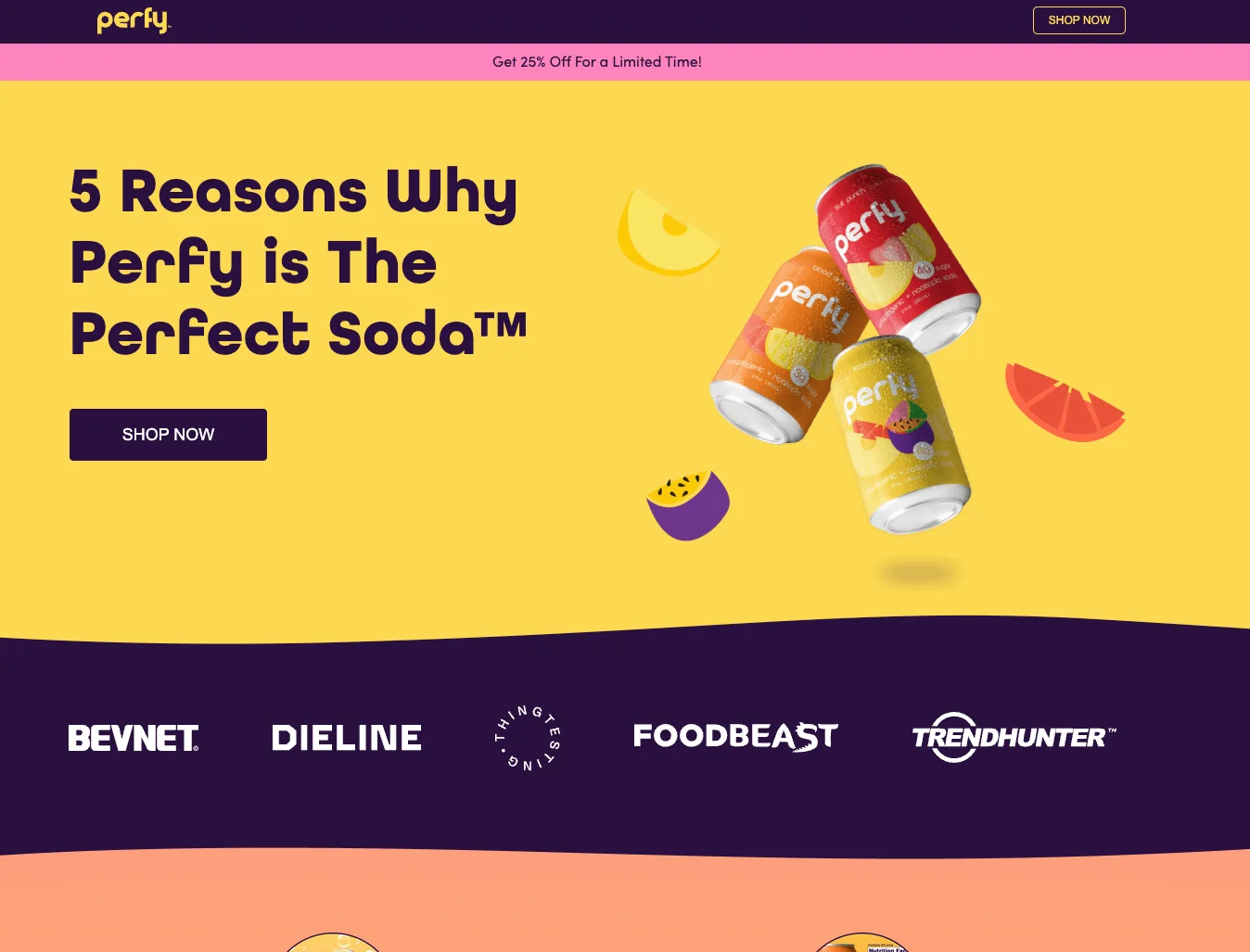
The move: include one reason that names the reader's self-concept. Identity ("for people who…") converts decisions into belonging, and it's the line people quote when they share the page.
The repeatable techniques
Pulled together, the examples share a small set of moves you can apply to any listicle landing page. None of them require a big budget — they're sequencing and framing decisions.
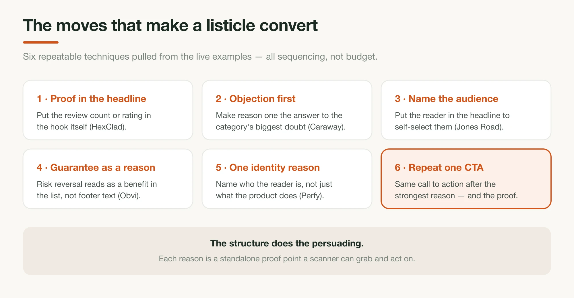
- Social proof in the headline (HexClad): a count or rating in the hook itself.
- Objection-first sequencing (Caraway, Venus ET Fleur): reason one answers the category's biggest doubt.
- Audience self-selection (Jones Road): name the specific reader in the title.
- A fear-based interrupt (Miracle Brand): one tension reason mid-list to re-engage scanners.
- Risk reversal as a reason (Obvi, Caraway): the guarantee is a numbered benefit, not footer text.
- An identity reason (Perfy): one line about who the reader is, not what the product does.
Two more patterns worth copying: leading brands run several listicle variants at once (Ridge and Jones Road both run multiple concurrent "reasons" pages) so they can test orderings and headlines at scale, and the strongest pages place a sticky CTA on mobile, where most of this traffic lands — and repeat one call to action after the strongest reason and after the proof, not only at the end.
When a listicle is the right call
A listicle landing page is the right format for warm, comparison-ready, and high-intent traffic — readers who already sense they want the category and need help deciding fast. For cold, skeptical traffic that doesn't yet feel the problem, a narrative advertorial usually converts better.
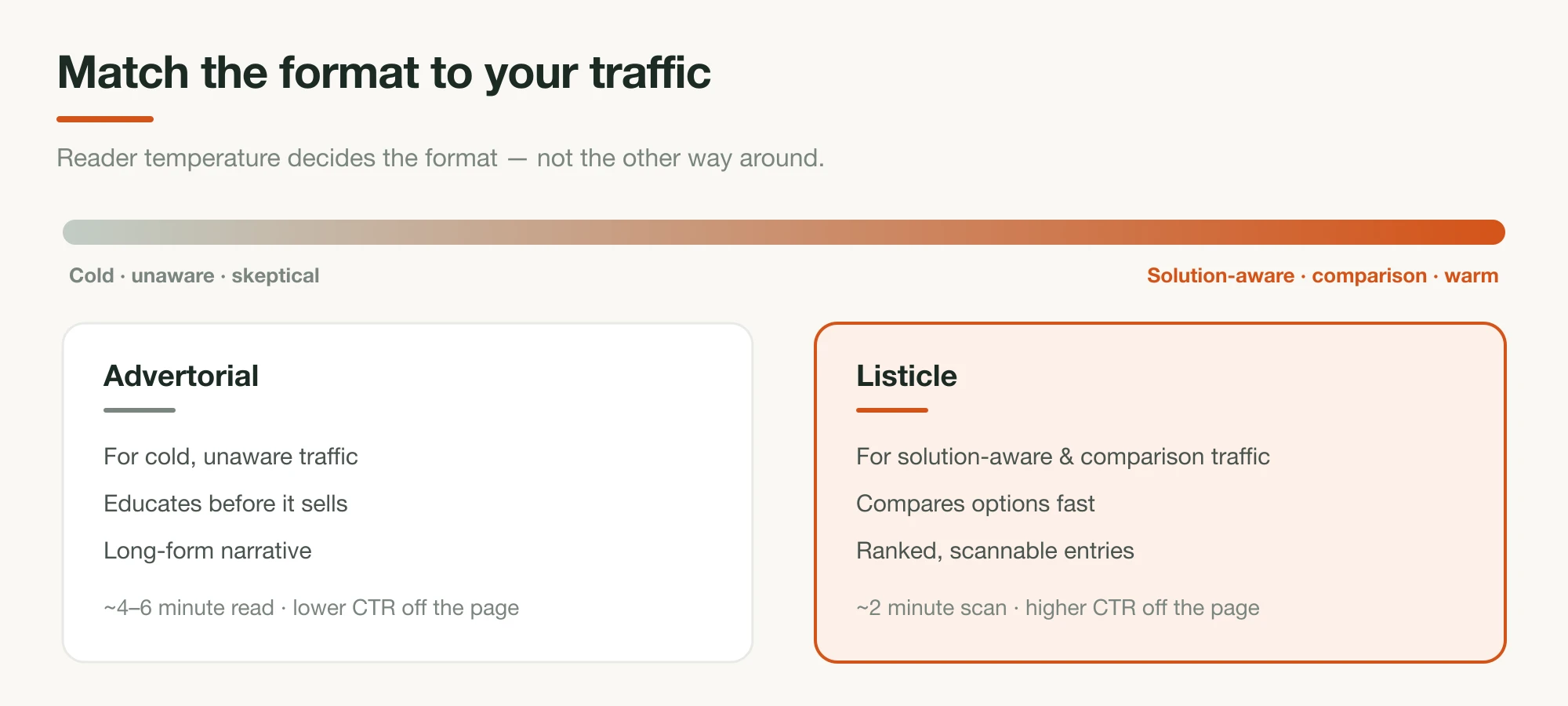
The full trade-off is in advertorial vs listicle: which converts better. Match the format to the reader's temperature, and run a disclosed-as-advertising label if it's paid traffic.
Build your own listicle page with Landra
Every technique above is a structural decision — which reason leads, where proof sits, how the headline self-selects. That's exactly the kind of best-practice structure Landra builds in. Tell it your product and the audience you're targeting, and it generates the whole optimized listicle page — the ranked reasons, the social proof placement, the copy, and the images — tuned to that reader and ready to edit in minutes.
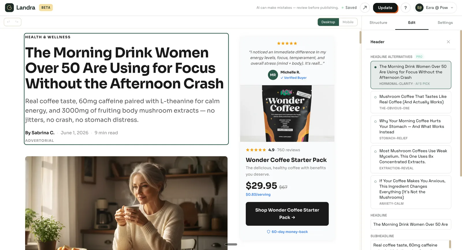
You don't have to reverse-engineer seven pages by hand; you start from one built on the same patterns, then make it yours.
The bottom line
The best listicle landing pages aren't longer or flashier — they're better sequenced. They lead with the objection that matters, put proof and guarantees inside the list, name the reader in the headline, and repeat one CTA. Steal the moves from the seven above, match the format to warm traffic, and test your variants like the brands that do this at scale. Then learn the full build in how to write a high-converting listicle.
Frequently asked questions
What is a listicle landing page?
A listicle landing page is a pre-sell landing page that makes its case as a ranked, numbered list of reasons ("5 Reasons Why…"), built to be scanned. It warms a shopper before the product page. It differs from a blog listicle (editorial content) and from a long-form advertorial (narrative prose).
Do listicle landing pages actually convert?
For warm and comparison-ready DTC traffic, yes — the format matches how people scan, and brands like HexClad, Caraway, and Ridge run listicle pre-sell pages. Reported conversion rates vary widely by traffic and product; benchmark against your own category rather than a headline number.
How many reasons should a listicle landing page have?
Most high-converting examples use five to seven reasons — enough to build a case without overwhelming a scanner. Some skeptical, high-consideration pages run ten (the Obvi supplement example below is one) to signal thoroughness. Let the category and price decide; fewer, stronger reasons usually beat a long, weak list.
What makes a listicle landing page convert?
Leading with the reader's biggest objection, embedding social proof and a guarantee as numbered reasons, putting the audience or a proof number in the headline, and repeating one CTA after the strongest reason. The structure does the persuading; each reason is a standalone proof point a scanner can grab.