
Adding a video to a landing page doesn't automatically make the page more persuasive. Motion can clarify a product, demonstrate ownership, humanize a claim, or guide a visitor toward the next step. It can also slow a mobile page, compete with the headline, or ask cold traffic to invest attention before earning it.
The useful question isn't “Should we add video?” It's “Which hesitation should this video resolve?” The seven landing page video examples below are organized by that conversion job. Each pattern includes practical guidance on production, placement, mobile behavior, and measurement, using clip role, message match, length, mobile behavior, and measurable action as the evaluation framework. For DTC teams, Landra can turn these ideas into editable, mobile-first presell pages when a video needs to bridge cold paid-social traffic to a product page.
Table of Contents
- 1. Wyzowl
- 2. Apexure
- 3. A1 Gallery
- 4. Zelios Agency
- 5. Landingi
- 6. SaaS Landing Page
- 7. Wistia
- 7-Example Landing Page Video Comparison
- Turn Inspiration Into a Testable Page
1. Wyzowl
Wyzowl's video landing page examples roundup is most useful when you're still deciding what job your video should perform. The collection presents 26 examples across B2B and B2C, including background videos, hero videos, supporting explainers, and pop-up players. That range makes it easier to compare a product film for emotional impact with a software demo designed to remove confusion.
The conversion job here is rapid understanding. A strong explainer should answer one question quickly: what is this product, who is it for, and why should the visitor care? SaaS teams can use a short interface walkthrough above or near the primary CTA. DTC brands can use a product demonstration lower on the page, where shoppers are already considering usage, fit, or setup.
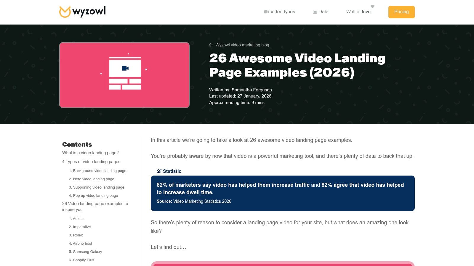
Use the gallery as a planning tool
The roundup gives useful context beside each example, but it doesn't provide a consistent performance dataset for every page. Treat it as a creative reference library, not proof that a particular layout converts better.
For production, script the first frame and the first spoken or displayed message around the visitor's existing problem. Keep the written headline visible, because visitors who don't play the video still need the offer. On mobile, use a poster image or click-to-play thumbnail unless the motion itself demonstrates the product without audio.
- Hero video: Use it when the product benefit is visual and immediately understandable.
- Supporting video: Use it when visitors need extra reassurance after reading the offer.
- Pop-up player: Use it when you want to preserve a clean page and let visitors opt in.
- Measurement: Track CTA clicks and downstream conversion, not only video plays.
If the video includes customer proof, pair the player with a clear next action and use this guide to testimonial page CTAs to keep the proof from becoming a passive content block.
2. Apexure
Apexure's video landing page examples guide takes a practical approach, pairing eight examples with recommendations on placement, message match, compression, captions, and calls to action. It suits teams that have chosen video and need to decide how much attention it should receive on the page.
The conversion job is attention without friction. Place the video where it reinforces the promise above the fold, while keeping the headline and CTA immediately findable. A muted product loop can support a short hero message when movement communicates texture, use, or atmosphere. An explainer or testimonial usually works better as click-to-play content, giving visitors control over attention and bandwidth.
Choose the format according to the question blocking conversion. DTC shoppers may need to see how a product looks, works, or fits into a routine. SaaS buyers may need a short explanation of workflow value before committing to a demo or trial. Keep the first frame tied to the written promise, and give the player a clear next action.
Treat speed as part of conversion design
A large hero asset can hurt performance before anyone watches it. Apexure cites Web Almanac findings showing that many mobile pages miss Google's 2.5-second LCP threshold, so loading speed belongs in the initial video test plan. The same Apexure guide also discusses performance considerations.
Practical rule: If the video delays the page's main promise, visitors wait before they understand why they should stay.
Produce a lightweight poster frame, lazy-load the player, and encode responsive versions for mobile. Test a static poster, a thumbnail-triggered player, and muted autoplay on the same page. Track CTA clicks and downstream conversion alongside LCP, bounce behavior, bandwidth, device type, and video plays. A lower play rate can still produce better commercial results when high-intent visitors are the people who load the full asset.
3. A1 Gallery
A1 Gallery's video landing page gallery is built for visual benchmarking. Its collection includes more than 130 examples, with quick access to live sites across categories. That breadth is useful when a team needs to find analogs for a product, a brand mood, or a specific layout pattern.
The conversion job is creating desire before detailed explanation. Background loops, product close-ups, and motion-led hero sections can help visitors imagine the product in use. A skincare brand might show texture and application. A furniture company might show the product in a lived-in space. A SaaS brand might use subtle interface movement to make an abstract workflow feel concrete.
Borrow the role, not the decoration
Design galleries can make polished pages look easy to copy. The risk is importing visual motion without understanding the original page's audience, traffic source, or performance constraints. A page built for returning brand traffic may not work for cold paid-social visitors who need a direct connection between ad promise and landing-page headline.
Use the gallery to collect patterns, then annotate each reference:
- Product signal: What does movement demonstrate that a still image can't?
- Message match: Does the first frame reinforce the campaign promise?
- Fallback: Does the poster image communicate the offer without playback?
- CTA relationship: Is the purchase or signup action visible beside the video?
- Mobile behavior: Does the composition survive a narrow viewport?
For teams building editorial-style presell pages, using Landra for listicles can provide a structured place to test a video against written comparisons, product benefits, and proof. The video should add evidence or context, not replace the page's readable argument.
4. Zelios Agency
Zelios Agency's SaaS and tech landing page video examples focus on 15 SaaS-specific examples. The collection emphasizes product demos, hero motion, social-proof reels, CTA placement, and onboarding clarity. That narrower focus makes it more relevant to software teams than a general design gallery.
The conversion job is making an unfamiliar workflow feel achievable. A SaaS demo should not attempt to show every feature. Show the shortest path from the user's current problem to a meaningful result. For example, a project-management product might show a task entering a workflow, receiving an owner, and appearing in a useful view. The viewer needs to understand the outcome, not memorize the interface.
Build demos around decisions
Start with the decision the visitor needs to make. Is the page asking for a free trial, a demo request, or an email? The video should prepare that action. A free-trial page can show the first useful moment inside the product. A demo-request page may need more emphasis on governance, integrations, or team adoption.
Keep the CTA outside the player and visible while the visitor watches. If a video expands into a lightbox, preserve a nearby route back to the signup or booking action. Add captions and an on-screen explanation of each important interface step, because many visitors will encounter the video without sound.
Measure:
- Meaningful watch depth: Did viewers reach the feature or outcome that matters?
- CTA interaction: Did they click the signup, demo, or pricing action?
- Activation quality: Did video viewers complete a meaningful product step?
- Audience fit: Did the video help the intended segment, or only generate passive plays?
The best SaaS demo is a compressed onboarding experience. It gives the visitor enough confidence to take the next step without turning the landing page into a product tour.
5. Landingi
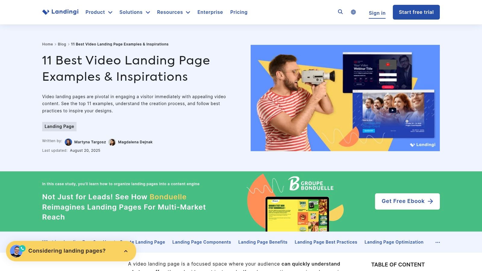
Landingi's video landing page examples works well for teams that need a broad set of accessible patterns rather than a highly specialized technical review. Its 11 examples cover background loops, hero demonstrations, testimonial reels, and supporting video blocks.
The conversion job is trust transfer. Product footage explains what something does, but a testimonial can help a visitor believe that the product works for someone like them. DTC brands can place a short customer story beside proof points, reviews, or a product CTA. SaaS teams can use a customer workflow clip to show adoption in context instead of presenting a feature list.
Connect viewing to purchase behavior
Sylvane's ecommerce testing offers a useful measurement model. Its product-page A/B test found that pages containing video were approximately 13% more likely to convert than pages without video. In a separate dehumidifier analysis, visitors who watched the video converted at 12.6%, compared with 8.7% among non-viewers, a relative improvement of approximately 45%. The Sylvane case study explains how event tracking connected view depth to purchases.
The important lesson isn't to copy those results as a benchmark. It's to instrument the experience properly. Track whether someone reached 25%, 50%, or 100% of the video, whether they clicked an in-video annotation, and whether they later added the product to cart or purchased.
For production, ask the customer to address one objection in plain language. Edit tightly, show the product in use, and place the purchase CTA both beside and below the player. Visitors who don't watch should still see the same benefit, proof, and action in text.
6. SaaS Landing Page
SaaS Landing Page's video landing page inspiration is aimed at software teams comparing hero video with inline product demonstrations. It presents 25 SaaS-leaning examples with design commentary and quick links to the featured pages.
The conversion job is turning product complexity into a clear mental model. Hero videos are useful when the product's central value can be understood quickly through motion. Inline demos are safer when the visitor needs written context before seeing a specific workflow. The choice should follow awareness level. A cold visitor may need the problem and outcome first. A high-intent visitor may be ready for a feature-level demonstration.
Choose the first frame carefully
A video thumbnail is part of the landing-page copy. It should show the product, the user, or the result, rather than an abstract play button over a generic background. Add a short label such as “See how the workflow works” when the action needs explanation.
The featured examples are useful for narrative structure, but older showcases require verification before implementation. Live pages change, and a visual pattern that looked strong at publication may no longer reflect current performance or mobile behavior.
Use this production sequence:
- Frame the problem: Show the task or frustration the buyer recognizes.
- Show the mechanism: Demonstrate the product's distinctive action.
- Reveal the outcome: Make the result visible and easy to understand.
- Repeat the next step: Keep the signup or demo CTA available outside the player.
SaaS teams should also test whether a short product GIF, annotated screenshot, or interactive preview can communicate the same idea with less loading cost. Video earns its place when it reduces uncertainty more effectively than those alternatives.
7. Wistia
Wistia's landing-page video guide takes a strategic view of placement, play rate, engagement, and the balance between video and page copy. Unlike a large gallery, it helps teams decide whether video belongs in the hero, in a supporting section, or in a conversion moment closer to the form.
The conversion job is capturing action at peak intent. A video can introduce the offer, but it can also create a useful signal about what a visitor cares about. A SaaS company might reveal a form after a product explanation. A DTC brand might place a product CTA after a demonstration of use, while keeping the purchase button persistent for visitors who skip playback.
Make engagement actionable
A HubSpot case study about a Wistia-hosted speaker-video program reported more than 600 contacts during the first 30 days after the later implementation. The setup embedded a four-field form and captured viewing behavior, including the percentage of each video watched and interaction heatmaps. The same case study also reports a campaign outcome of $660,000 in annual recurring revenue, annual-plan adoption rising from 2% to 22%, and a 64% increase in contact-form conversion. These results belong to that specific program, not to video in general. See the HubSpot and Wistia case study for the implementation context.
For a DTC page, translate the approach into first-party events:
- View depth: Record 25%, 50%, and 100% milestones.
- Interaction: Track player clicks, annotation clicks, and CTA clicks.
- Commercial outcome: Connect engagement to add-to-cart, checkout, and purchase.
- Variant comparison: Compare video with a static or image-led version.
Landra's video ad examples can help teams think about the relationship between ad creative and presell content. The landing page should continue the winning message from the ad, then give visitors a clear route to purchase.
7-Example Landing Page Video Comparison
| Resource / Item | Implementation complexity 🔄 | Resource requirements ⚡ | Expected outcomes 📊⭐ | Ideal use cases 💡 | Key advantages |
|---|---|---|---|---|---|
| Wyzowl | 🔄 Low, curated examples, minimal technical steps | ⚡ Low, reading and benchmarking time | 📊⭐ Inspiration + practical tips; limited performance metrics | 💡 Broad landing page inspiration; hero/explainer/demo ideas | Credible agency perspective; up-to-date UX patterns |
| Apexure | 🔄 Low, concise, prescriptive guidance | ⚡ Low, easy to apply recommendations | 📊⭐ Conversion-oriented outcomes if followed; actionable CRO tips | 💡 Teams wanting quick, implementable best practices | Do's/don'ts and performance-minded suggestions |
| A1 Gallery | 🔄 Low, visual gallery, no how-to depth | ⚡ Moderate, time to browse many examples | 📊⭐ High visual impact and idea discovery; little conversion data | 💡 Rapid visual benchmarking and trend-spotting | Exceptional breadth (100+ examples); frequently updated |
| Zelios Agency | 🔄 Low, focused curation for SaaS | ⚡ Low, targeted review for relevance | 📊⭐ Strong relevance for demo/onboarding clarity in SaaS | 💡 SaaS/tech teams refining product demo and onboarding | Niche focus; practical placement notes for CTAs |
| Landingi | 🔄 Low, concise roundup, platform-agnostic | ⚡ Low, quick to skim and adapt | 📊⭐ Good starting ideas; light on performance detail | 💡 Non-technical teams seeking accessible inspiration | Simple guidance covering multiple video roles |
| SaaS Landing Page | 🔄 Low, design-led showcase for software | ⚡ Low, quick visual review | 📊⭐ Useful for narrative and UI walkthrough planning | 💡 SaaS teams comparing hero vs inline demos | SaaS-focused curation; clear design commentary |
| Wistia | 🔄 Medium, tactical how-to guidance | ⚡ Moderate, requires measurement/implementation effort | 📊⭐ Strategic improvements to play rate and engagement | 💡 Teams building video strategy and placement tactics | Authoritative, metric-aware advice on video placement |
Turn Inspiration Into a Testable Page
The strongest landing page video examples don't all use the same format. They use video to solve a defined conversion problem. Choose the pattern by asking what the visitor still needs to believe: that the product is understandable, that the claim is credible, that ownership will feel easy, or that taking the next step is safe.
Then match the clip to awareness. Cold paid-social traffic usually needs a direct connection between the ad promise, the headline, and the first visual frame. A warm visitor may be ready for a deeper demo, testimonial, comparison, or proof sequence. Don't make a long video carry the entire sales argument. Keep editable text, product details, social proof, and a persistent CTA on the page.
Muted mobile viewing should be the default design constraint. Captions, transcripts, descriptive labels, and a poster image ensure that the core claim survives without audio. Searchlab summarizes research reporting that 85% of Facebook videos were watched without sound and that captions were associated with a 40% engagement increase. Those figures appear in Searchlab's digital accessibility statistics, but the practical lesson is broader: if the video needs sound to make its point, many visitors won't receive the point.
Track play rate, meaningful watch depth, CTA interaction, add-to-cart or signup behavior, and downstream conversion. A play is an attention signal, not a business outcome. Compare the video version with a static poster or image-led version, and segment results by device, traffic source, and audience message.
Before publishing on Shopify, Landra, Webflow, or HTML, run this short process:
- Choose one conversion job for the video.
- Write a message-matched headline and poster frame.
- Create a muted mobile fallback with captions.
- Keep the primary CTA visible outside the player.
- Add view-depth and downstream conversion events.
- Test page speed before sending paid traffic.
- Duplicate the page to test a different opening, placement, or format.
Landra can generate editable presell pages from a product URL and publish them to Shopify, a Landra-hosted URL, Webflow, or HTML. That workflow is useful when you need to connect a winning video angle to a faster page variant without rebuilding the page from scratch.
Use Landra to turn a product URL into an editable, mobile-first advertorial or listicle that carries your video message from paid social to the product page. Visit Landra to create a presell page, refine the copy and media, and publish a testable variant.