
A shopper taps your Meta ad for a $140 device. The page loads, looks sharp, shows the product and the price, and puts an Add to Cart button above the fold. Four seconds later they're gone.
Nothing on that page is broken. The button is big. The photography is clean. It asked a cold visitor to commit before it gave them a reason to. Cold traffic doesn't arrive wanting to buy. It arrives wanting to know whether the thing in the ad is real, whether it works, and whether the seller can be trusted.
A product page skips those questions and goes straight to the close. That's why I read landing-page galleries as teardowns instead of swipe files. The question isn't whether a page looks good. It's which element carries the persuasion, which awareness stage the page targets, and what happens to it on a slow phone.
Search for best landing pages examples and you get a wall of screenshots, most of them caught on a desktop. The seven resources below are a different cut of that list. Each one is a place to find examples, plus a breakdown of the design and conversion logic inside it, so you can judge pages by mechanism rather than appearance. Where a resource's examples are unverified, I say so. If your problem sits above page design, start with funnel optimization for Tier 1 audiences.
Table of Contents
- 1. Examples
- 2. AdSpends
- 3. ScrollStash
- 4. Swipe Pages
- 5. DTC Landing Pages
- 6. Unbounce
- 7. Shopify
- How the Best Landing Page Example Sources Compare
- Turn These Examples Into Your Next Pre-Sell Test
1. Examples
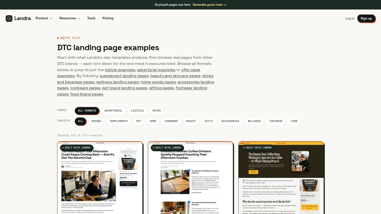
A cold click from Meta still needs a reason to stay. Landra's Examples page collects the formats built for that job: editorial advertorials, ranked listicles, and mobile-first pre-sell pages for DTC brands. On each page, check the awareness stage it meets, the block that carries the persuasion, and the piece you can lift into your own pre-sell test.
Paste a product or brand URL. The generator reads the site's offers, reviews, ingredients, and proof, then returns a structured draft in the brand's own language instead of placeholder copy. You rewrite the copy, swap images, and reorder sections in an inline editor, then publish to Shopify, a Landra-hosted URL, or clean HTML.
Judge the page against its own benchmark
A page that looks finished on a large monitor can still fail paid social. The 2020 Unbounce Conversion Benchmark Report, covering more than 186 million visits and roughly 34,000 landing pages across 16 industries, put the median landing-page conversion rate at 3.2%, the arithmetic average at 9.7%, and the top-quartile median at 25%, nearly eight times the overall median, according to the Unbounce Conversion Benchmark Report 2020.
That spread kills any single "good" rate. A page at 4% can be the right model for a cold offer and a weak one for warmer traffic. Match the example to the traffic, not to how polished the screenshot looks.
Practical rule: Copy mechanism, not appearance. I would take the message match, the proof placement, and the offer block. I would leave the font alone.
Where it works
- Format range: advertorials for problem-aware readers, listicles for comparison shoppers, and pre-sell pages that build intent before checkout.
- Brand-grounded drafts: the first pass uses the site's messaging, proof, and ingredients, so the open matches the product the ad named.
- Publishing fit: Shopify, a hosted URL, or clean HTML export.
- Editing control: inline edits to copy, images, and section order before you put spend behind the page.
Where it falls short
- No results beside the examples: the library shows format and structure, not verified conversion or spend, so a clean layout is a hypothesis.
- Edit before launch: generated drafts still need a pass for accuracy, brand fit, and compliance. A wrong claim on a cold-traffic page wastes the click.
If listicles are the format you're testing, the guide on how to turn product URLs into listicles walks through the structure. For a wider read, this set of seven high-converting landing page examples is worth a scroll.
2. AdSpends
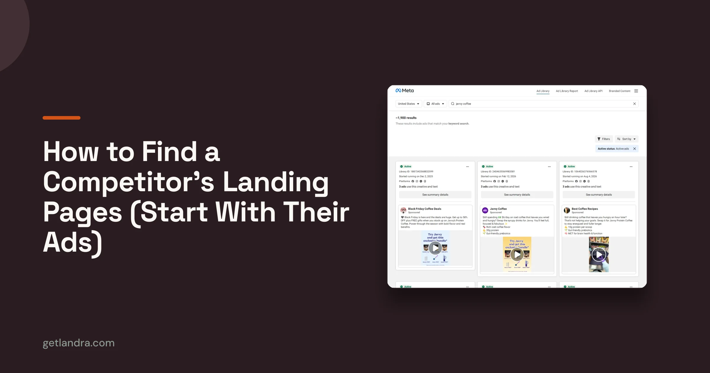
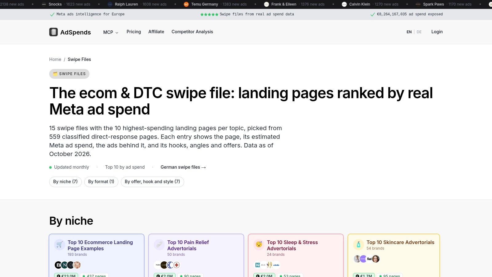
You click a Meta ad, land on the page, and the headline never restates the hook you just stopped for. That break is why a swipe file only pays off when the ad sits next to the page. AdSpends sorts DTC landing pages by niche, format, offer, hook, and style, with separate advertorial, skincare, and pain-relief collections. Each entry can pair a page with the Meta ads that fed it, so you can follow one angle from thumb-stop to headline to CTA.
Read the pair as a teardown, not a lookbook. Name the awareness stage the ad assumes. Cold traffic still needs the page to restate the problem before the offer, or the click has nothing to hold onto. The piece that carries persuasion is usually the hook, repeated on the first screen, not the hero photo. Copy that message match into your own pre-sell test. Leave the layout.
Treat the spend column as a research signal
Spend estimates come from public Meta reach data plus an assumed CPM. They show how hard a brand is pushing a page. They do not show that the page converts. A brand can route serious budget into a weak page and miss it for a quarter.
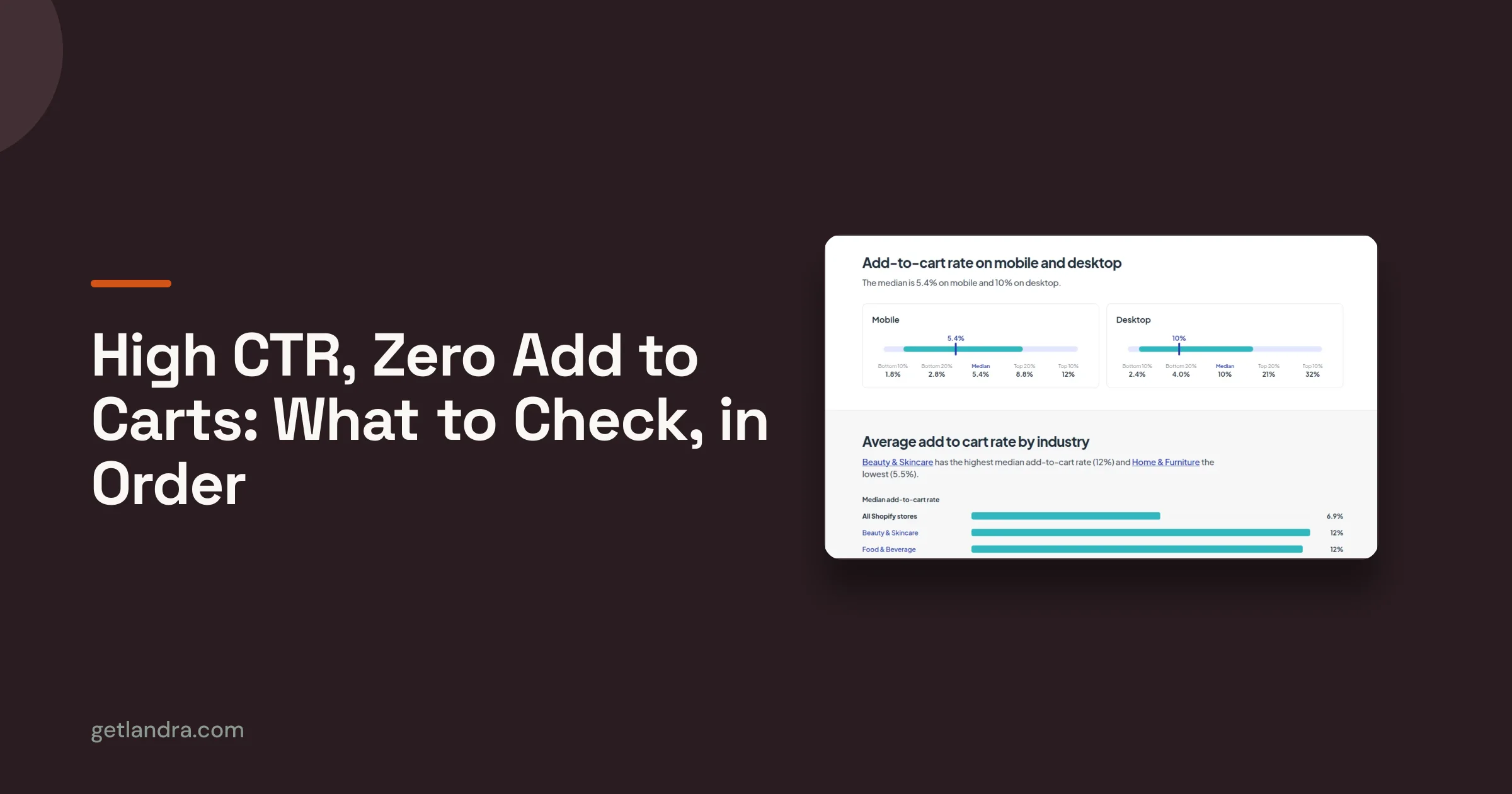
Average landing-page conversion rates vary widely by industry and offer, so read spend next to conversion data rather than on its own. Those are two different columns.
Advertorial, skincare, and pain-relief pages sit on their own shelves, with hooks, offers, and formats tagged on each entry. Public swipe files are described as updated monthly, and the dataset notes how often offers and page elements repeat. That repetition is the part worth copying. If the same proof block shows up across cold-traffic advertorials in one niche, test the block, not a new color system. If a result is claimed and you cannot see it in the ad-and-page pair, treat the example as unverified and judge the mechanism instead.
Full classified-page access requires AdSpends access, and public pricing is not stated. Estimates can also flatter a brand's testing discipline. Light estimated spend may just mean newer creative, not a quieter winner.
3. ScrollStash
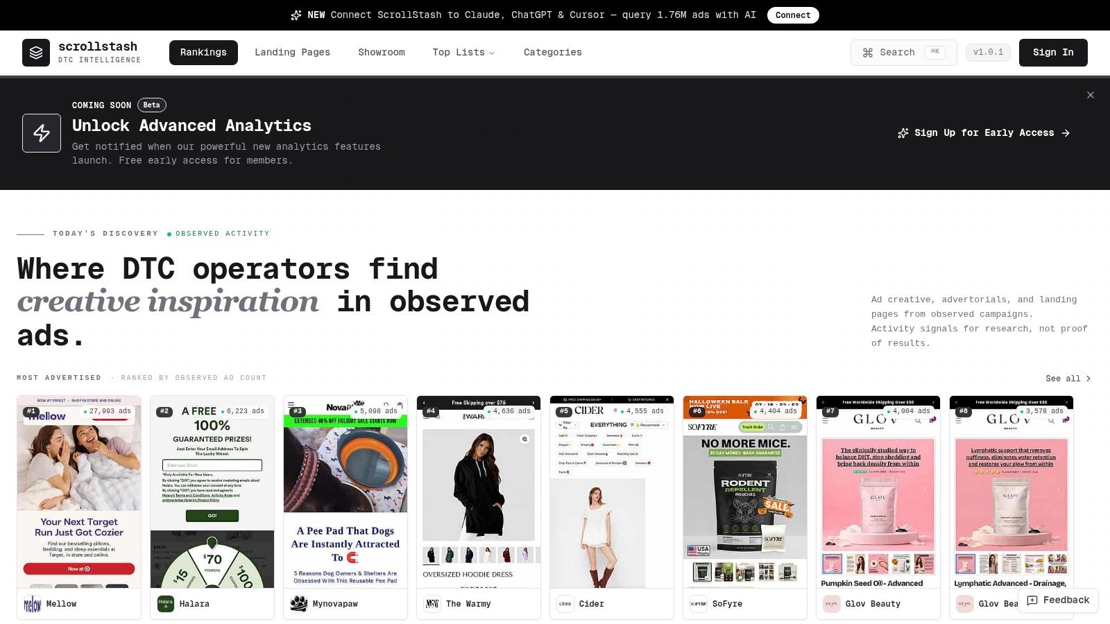
The hardest page to find is the one a competitor is scaling right now. ScrollStash indexes DTC brands and ads, with separate collections for advertorials, top listicles, product pages, and trending landing pages. Browsing by format instead of by brand is the useful part: pull thirty advertorials in one category and the repeated structures become obvious.
Filters cut by category, page type, brand, or signal. You'll need them, because the index is large and unfiltered scrolling burns an afternoon.
Open the example on your own phone first
A gallery screenshot is a desktop artifact. Traffic isn't. In one large landing-page dataset, mobile devices generated 83% of visits while desktop visitors converted about 8% better, and only about half of sites met all three Core Web Vitals in 2025 against Google's good thresholds of LCP 2.5 seconds or less, INP 200 milliseconds or less, and CLS 0.1 or less, per Cartflows' landing-page statistics. Volume and efficiency split by device.
A layout that reads clean at 1440 pixels can bury the CTA below a fold that never ends on a phone. Load the example on cellular, scroll it with a thumb, and count how many taps it takes to reach the offer.
Where it works
- Advertorial and listicle shelves: the two formats pre-sell funnels need.
- Campaign-linked pages: real pages tied to observed ad campaigns, not design mockups.
- Category research: broad enough to map a whole vertical's conventions.
Where it falls short
- Freshness varies: a listed page may not reflect a brand's current funnel.
- Scale becomes noise: the database is big enough to hide the good examples.
- Access unclear: pricing and limits weren't established in the reviewed material.
4. Swipe Pages
Twelve advertorials is a small gallery, and that's the point. Swipe Pages' advertorial collection shows Beauty Multitasker, Supply, AutoBrush, Cometeer, and Blissy alongside commentary on storytelling, problem-agitation-solution structure, and contextual social proof. Each entry tells you what to look at, which is rarer than it should be in inspiration libraries.
The structure repeats across the collection. Open on a specific problem, agitate until the reader recognizes themselves, introduce the product as the mechanism, then prove it before the offer.
Where the proof sits decides the page
Placement is testable, and there's a clean example outside DTC. An executive-education page converted brochure-download visitors at 3.91%. After heatmap analysis and wireframing, the team moved video testimonials and an About Us block above the programme details. The variant converted at 6.38%, a 63% lift, on the same offer and traffic, per the Apexure case study.
Different vertical, same mechanism. Proof placed where the reader hesitates beats proof stacked at the bottom after three screens of description. In an advertorial, that usually means a review or demonstration directly after the opening claim, before the product explanation.
Look at where the first testimonial appears. If it lands below the halfway mark, the page is asking for trust before it's earned any.
The caveats matter. The advertorial gallery is smaller than a broad landing-page library, the publisher also sells a landing-page product so the surrounding advice is vendor content, and none of the examples are presented as independently verified conversion winners. Read it for structure, not for proof of results.
5. DTC Landing Pages
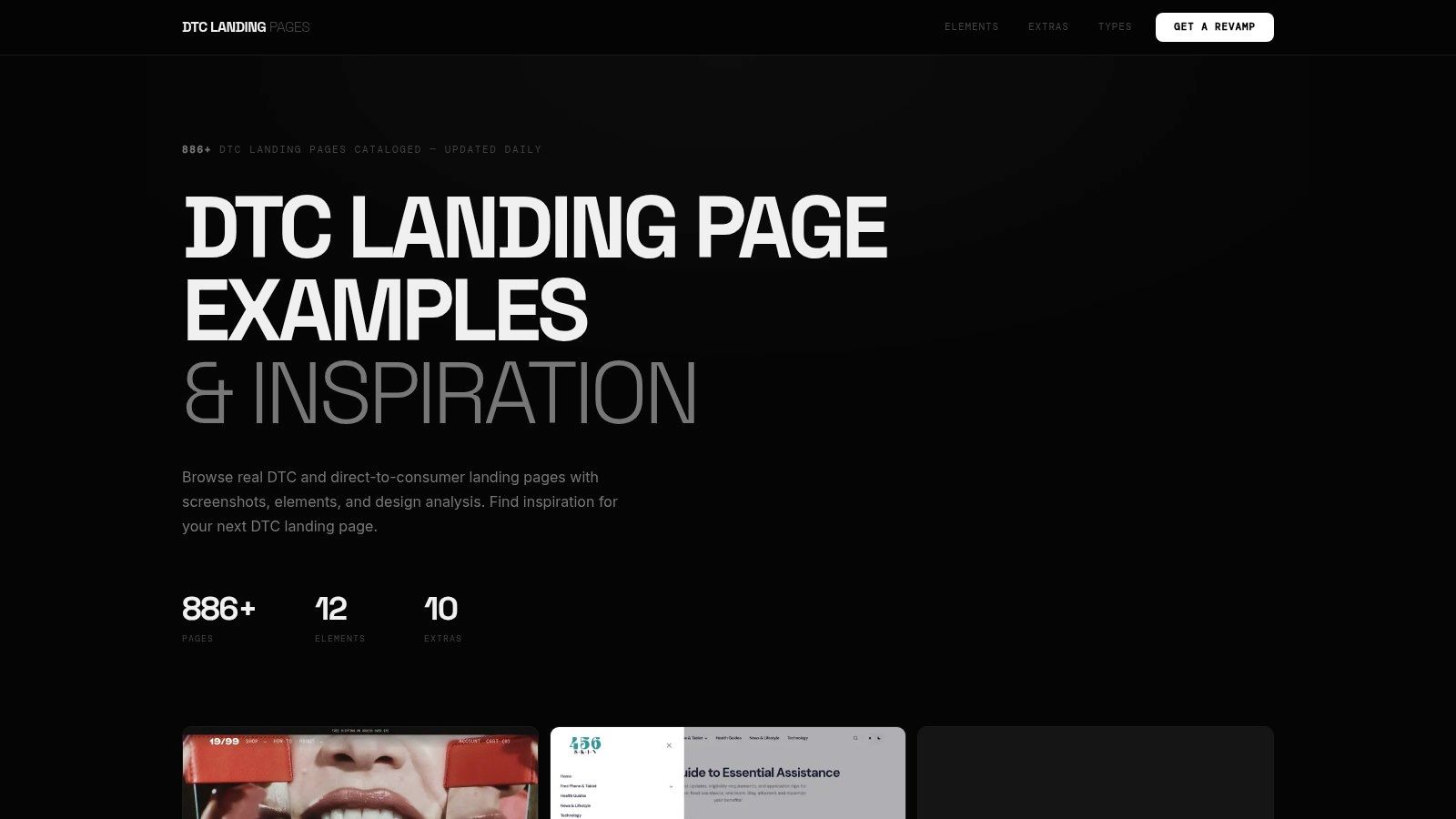
Component-level browsing is what separates this one. DTC Landing Pages reported more than 886 pages when I reviewed it, filed by page type and by the elements inside them: testimonials, sticky CTAs, comparison tables, FAQs, guarantees. If you want to see how ten skincare brands handle a guarantee block, look here.
Element count is a conversion variable
Adding sections feels like adding persuasion. Past a point, it adds load instead. Google's mobile landing-page research, covering 11 million mobile ads and landing pages across 213 countries, found that as page elements rose from roughly 400 to 6,000 (text, titles, images), the probability of conversion fell by 95%. The same analysis found bounce probability rising 123% as load time climbed from one second to ten, per Google's mobile page speed benchmarks.
That reframes the comparison table you're about to copy. A page carrying a sticky CTA, three testimonial blocks, a video, a quiz, and a comparison table may be one section away from the point where the visitor never sees any of it.
- Steal one component at a time: isolate the guarantee block or the comparison table, not the whole page.
- Count sections before you ship: every added block is weight on a cold mobile connection.
- Test the element, not the vibe: keep copy and offer constant while you change one component.
The trade-offs are honest. The DTC focus makes it weak for SaaS or lead-gen pages, some listings lack screenshots, and the site promotes a page-revamp service separate from the gallery. If you need a starting structure rather than inspiration, this set of advertorial tools for DTC brands covers the formats.
6. Unbounce
Forty examples in one place, with commentary. Unbounce's best landing page examples covers ecommerce alongside SaaS and education, with entries on Zola, Goby, Coco Village, Grass Roots, and Western Rise. Each write-up explains why an element might work, which makes it more useful for analysis than a screenshot dump.
One bias to price in. Unbounce sells a landing-page builder, and the roundup notes that many of the examples were built with it. The commentary is still worth reading. The examples aren't independently verified conversion winners, and no gallery's are.
What verified performance actually looks like
This is the standard I'd hold every gallery to. Metromile tested an AMP quote page against a visually identical non-AMP page, split mobile search traffic through an AdWords campaign experiment, and held copy, offer, and layout constant. On a 3G connection the AMP page loaded almost 80% faster, and on 4G it was 76% faster. The faster experience produced a 13% higher click-through rate and cut mobile cost per conversion by 23%, per the Metromile AMP case study.
Same design, different implementation, measurable result. That's a page you can learn from.
A gallery tells you what a page looks like. A test tells you what a page does. Only one of those is copyable.
The gaps are worth naming. Unbounce isn't focused on advertorials or DTC pre-sell pages, so the ecommerce entries skew toward product and campaign pages. Use it for cross-industry structure, then take your pre-sell pattern from a source closer to cold paid social.
7. Shopify
Brand-led examples written for merchants. Shopify's ecommerce landing page examples works through Brightland, Rare Beauty, Olipop, Liquid Death, and ButcherBox, and the commentary stays on four levers: headline, visual, social proof, CTA. It discusses above-the-fold choices and brand-matched copy, then suggests how to apply the idea to a live store.
That framing fits Shopify merchants better than a generic SaaS gallery. Liquid Death and Olipop sell identity, so their pages carry personality where a supplement brand carries mechanism.
Where this guide stops short
It's an editorial guide, not a searchable archive. You can't filter by page type or element, so it's a read, not a lookup. It also stays on ecommerce broadly, which means advertorial and listicle funnels get thin coverage. Shopify has a commercial interest in ecommerce adoption, and the examples illustrate principles rather than report outcomes.
The practical move is to borrow one lever at a time. Take the headline structure without the voice. A brand-matched headline you can't write yourself is worse than a plain one that states the offer and the price.
- Read the hero for message match: does the first line repeat the ad's promise in different words?
- Audit proof placement: which review or demonstration appears before the first product explanation?
- Time the CTA: how many screens pass before the visitor gets a next step?
Once you know which lever you're testing, the on-ramp is to customize Shopify templates for cold traffic rather than rebuild a theme. The page you test shouldn't live inside the theme anyway, because every variant then risks touching the storefront.
How the Best Landing Page Example Sources Compare
| Item | Best for | Format focus | Key limitation |
|---|---|---|---|
| Examples | Creating and testing mobile-first DTC pre-sell pages | Advertorials, listicles, and landing pages | Specific examples are not shown; generated drafts need review |
| AdSpends | Paid-social and DTC campaign research | Landing pages linked to Meta ads, hooks, offers, and estimated spend | Spend is estimated and does not confirm conversion performance |
| ScrollStash | Researching competitor campaigns and pre-sell funnels | Advertorials, listicles, product pages, and campaign-linked pages | Broad database can be difficult to navigate; data freshness varies |
| Swipe Pages | Finding advertorial inspiration and studying page structure | Advertorials and broader landing-page examples | Small advertorial gallery; examples are not verified conversion winners |
| DTC Landing Pages | Comparing ecommerce pages and reusable page components | DTC product, campaign, waitlist, and comparison pages | DTC-focused; some listings lack screenshots |
| Unbounce | Exploring landing pages across industries | Ecommerce, SaaS, education, and other landing pages | Not focused on advertorials; examples do not verify conversion results |
| Shopify | Learning ecommerce landing-page design and messaging | Product-focused, brand-led, and social-proof pages | Editorial guide, not a searchable archive; limited focus on pre-sell funnels |
Turn These Examples Into Your Next Pre-Sell Test
Seven resources, one workflow. Many use a gallery to collect screenshots and then stall. The teams that get something out of it run a sequence instead.
Start by matching the example to your traffic temperature. Cold Meta or TikTok traffic needs an advertorial or a ranked listicle, because the visitor has no context and no intent, and the page has to build both before it asks for a click. Warm retargeting traffic can handle a shorter offer page, since the reader already knows the product exists.
Next, extract two or three elements, not a whole page. The opening frame is the one worth copying first, because it decides whether the reader scrolls at all, and it's the element most often mismatched with the ad. Proof placement comes second: find where the example puts its first review relative to the product explanation, and test moving yours earlier. CTA timing comes third. Some pages convert by asking at the first fold, others by asking after the demonstration, and only your traffic can tell you which.
Then build one variant from your own brand context. Your ingredients, your reviews, your guarantee, your price. Lifting another brand's voice produces a page that reads like a costume, and cold readers are quick to spot it.
Publish the variant separately from your storefront so the test doesn't change your checkout flow, then run it against your product page on the same ads, the same audience, and the same budget. Compare conversion rate and downstream quality together, meaning add-to-cart rate, checkout completion, and revenue per visitor. A higher click rate with weaker intent is a loss wearing a better number.
Judge the result against the relevant benchmark, not a universal one, and give the test enough volume to say something. Two variants and one offer will teach you more about your audience than another hour in a gallery. When you want to know how the creative feeding that page performs before you build the next variant, read this on how AI-generated ad creative performs.
Landra turns a product URL into a mobile-first advertorial, listicle, or pre-sell page you can edit inline and publish to Shopify, a hosted URL, or clean HTML in minutes, no agency build required. Because those pages live outside your Shopify theme, you can test a new angle without touching your storefront or checkout. Visit Landra and generate your first page from the product you're already running ads to.